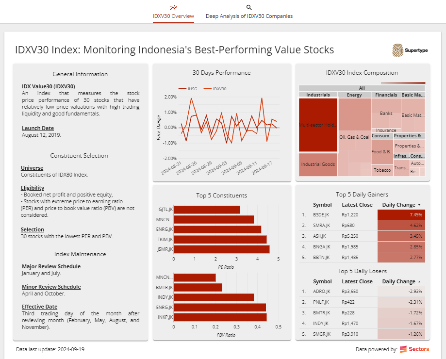
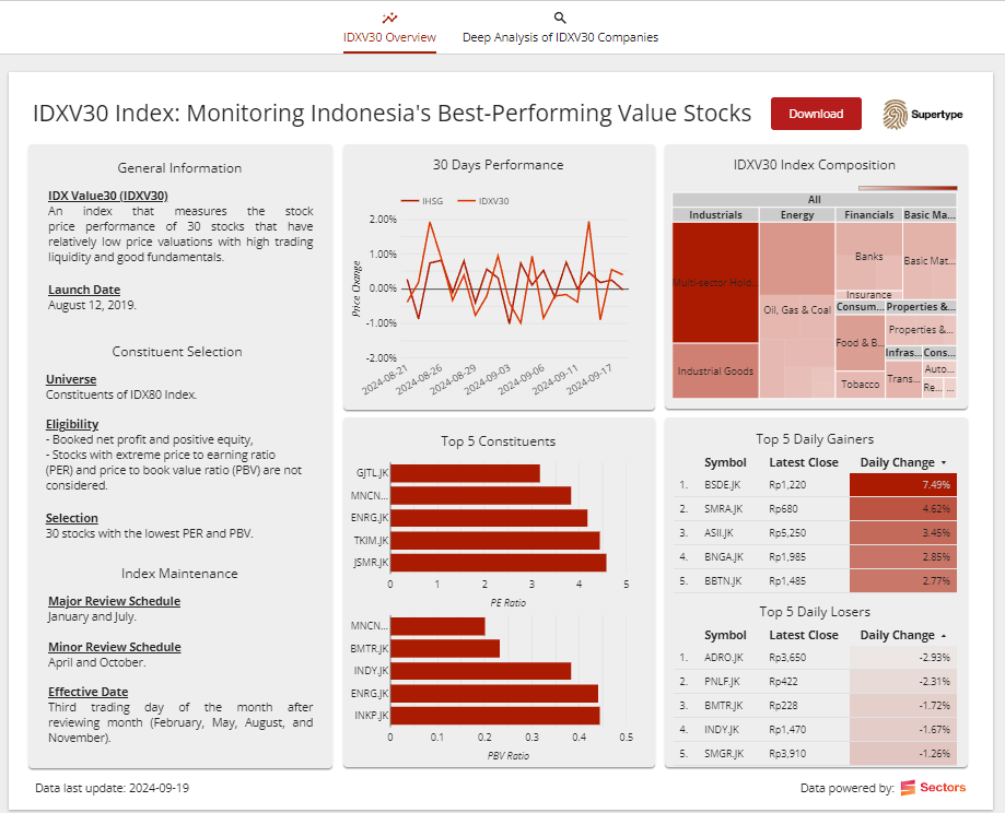
IDXV30 Index: Monitoring Indonesia’s best-performing value stocks
In this recipe, we’ll explore how to build a financial dashboard to track the IDX Value30 (IDXV30) index, one of the most notable stock indices on the IDX. The IDXV30 tracks the performance of 30 stocks that not only trade at relatively low valuations, as reflected by the lowest PE ratios and PBV ratios, but also demonstrate strong liquidity and solid fundamentals. As of October 21, 2024, based on data from Sectors.app, the IDXV30 has recorded the highest year-to-date (YTD) growth among all indices, with a remarkable increase of +12.64%. Given this outstanding performance, we’ll dive deeper into the IDXV30 and analyze its performance.Connecting financial data to Looker Studio
In the previous recipe, Calvin has taught you how to connect our Sectors Financial API to the Google Sheets. Now, we’ll take it a step further by directly using this Sheets, which contains data retrieved from the Sectors Financial API, to build our dashboard in Looker Studio. To get started, open the sheet and make a copy so that you have your own version. This will allow you to connect it to your personal Looker dashboard.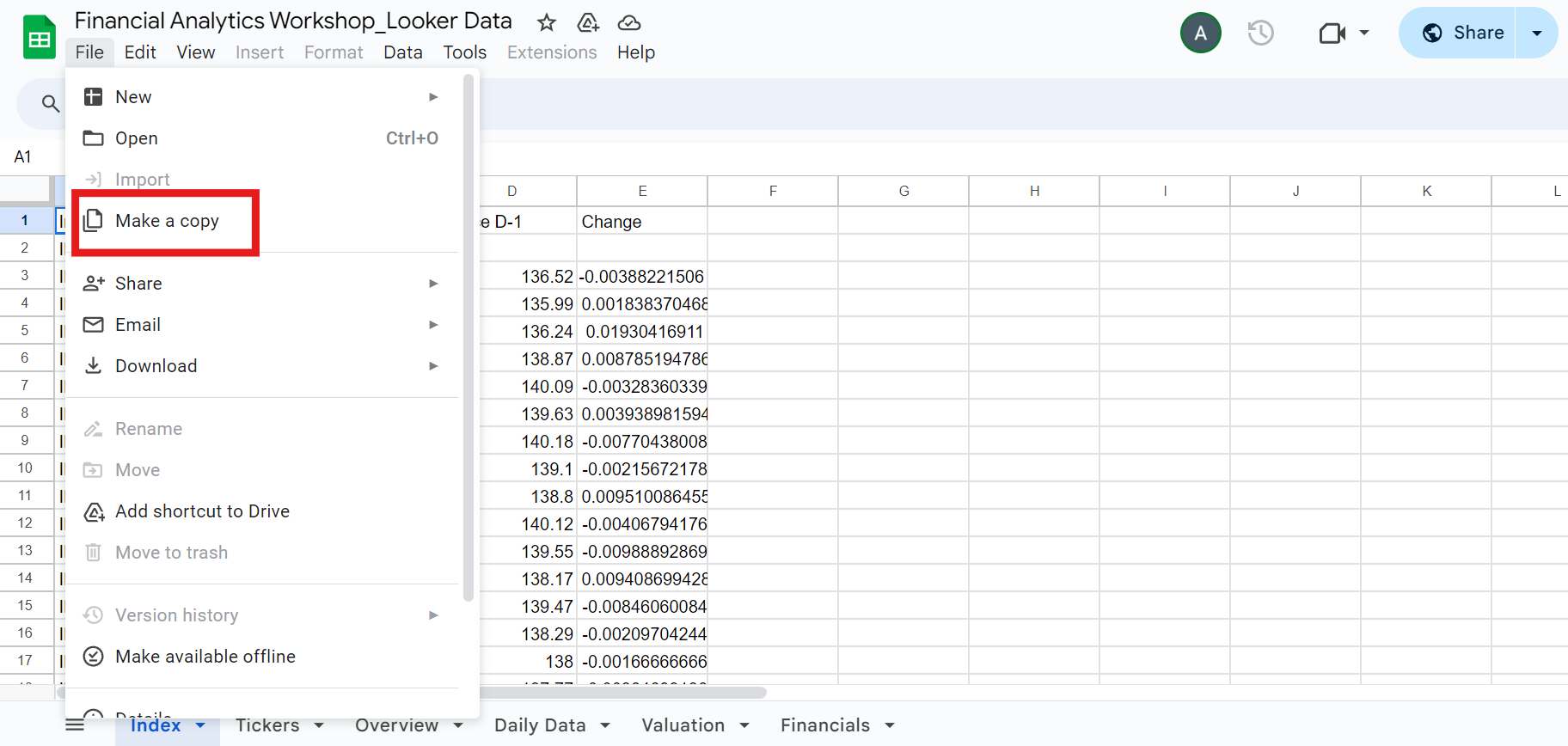
Add data menu.
Index sheet data:
-
Click the
Add datamenu. - Select Google Sheets and authorize Looker to connect to your Google Sheets.
-
Select the sheet you previously copied, select the
Indexworksheet, and click theAddbutton: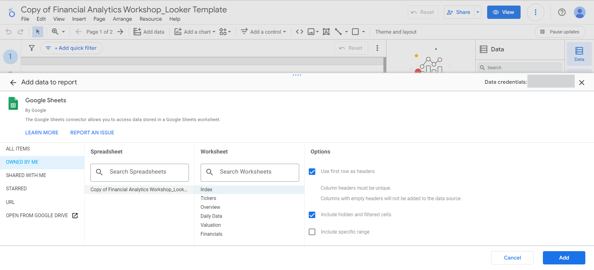
Add to reportbutton to proceed. -
After adding the data, you can add new fields,
parameters,
or additional data through the
Datapane: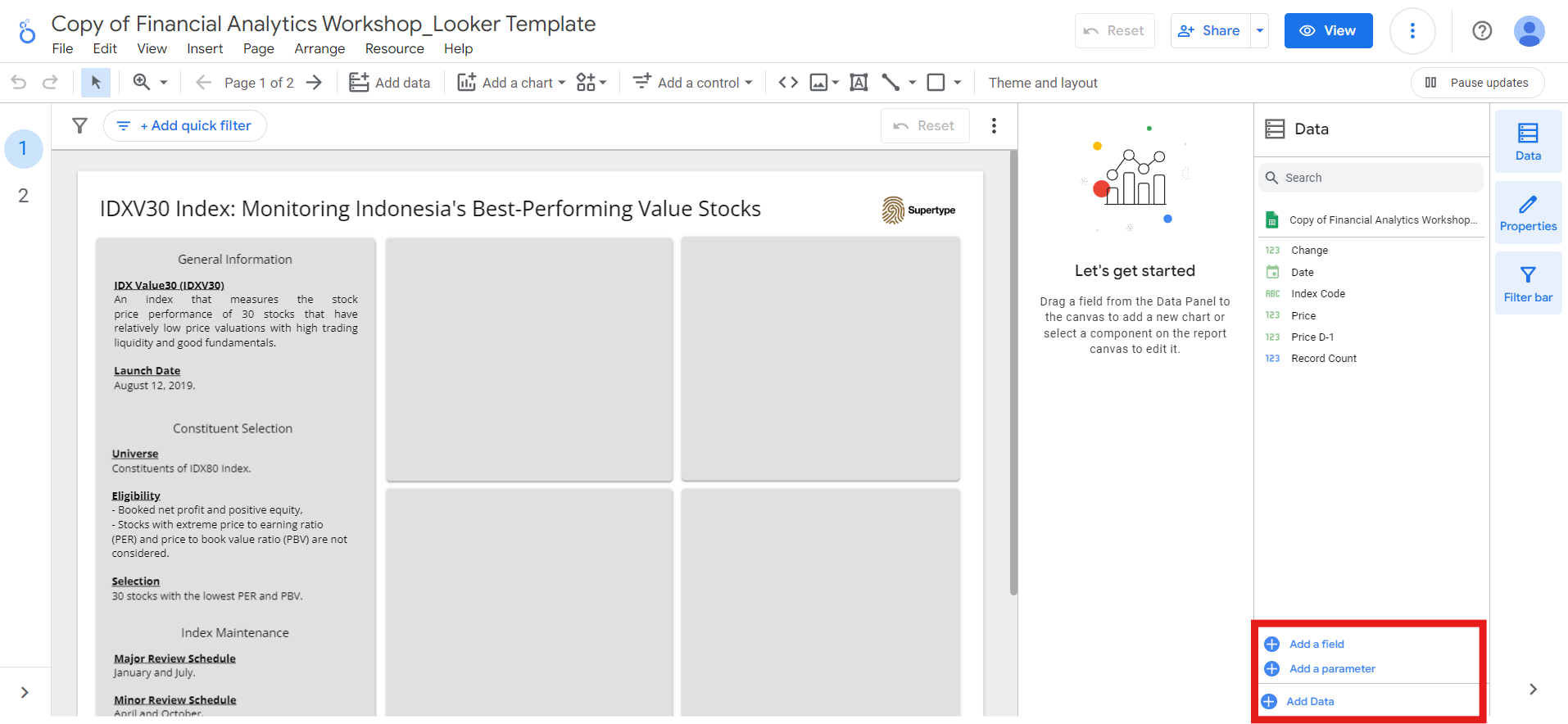
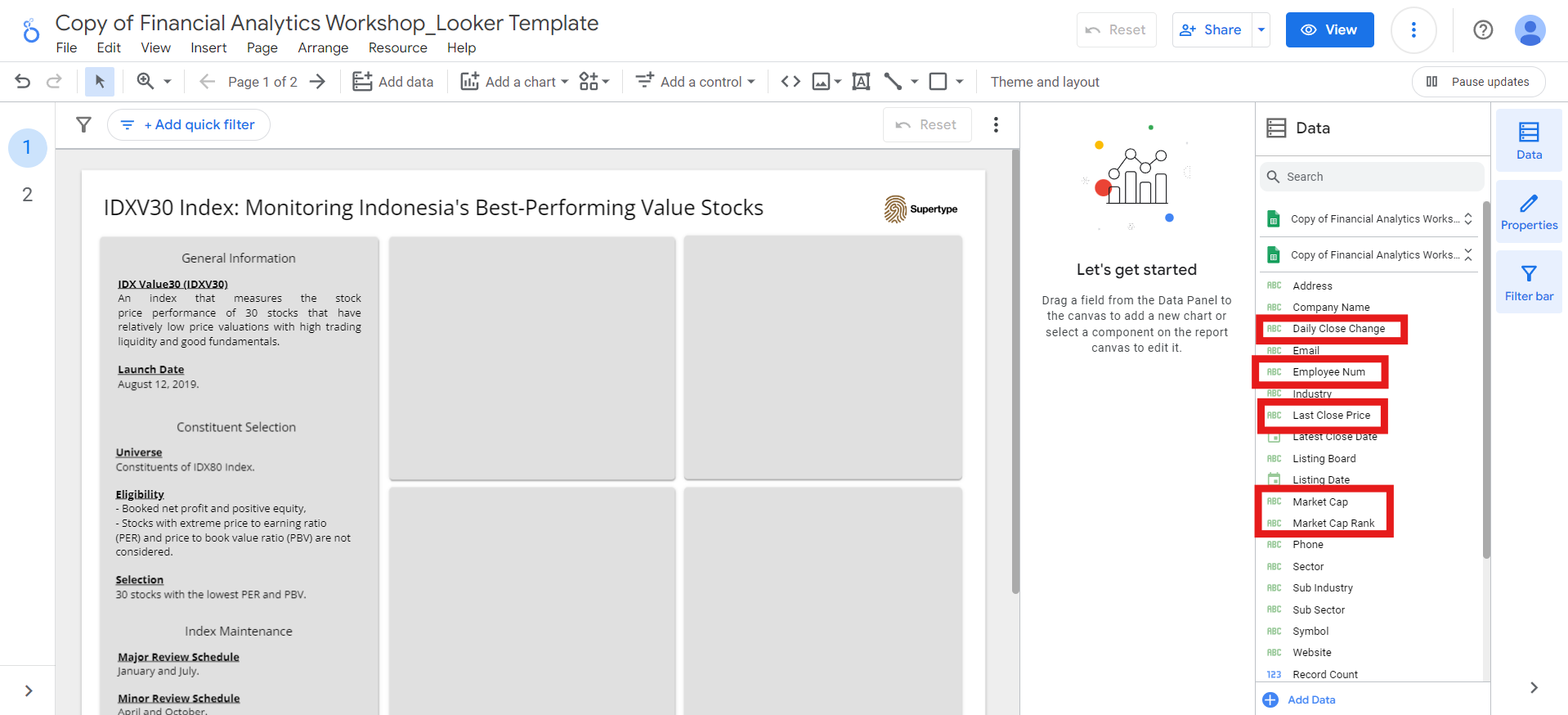
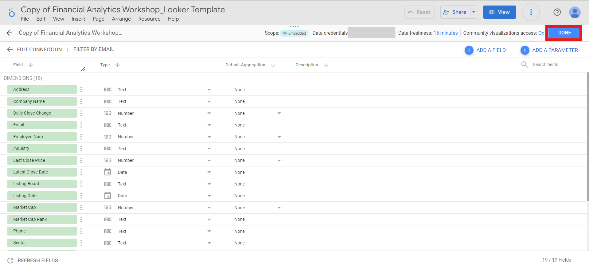
Overview, Daily Data, Valuation, and Financials.
Be aware that some fields may have incorrect data types, such as Daily Close Change, Employee Num, Last Close Price, Market Cap, and Market Cap Rank in the Overview data.
Resource > Manage added data sources.
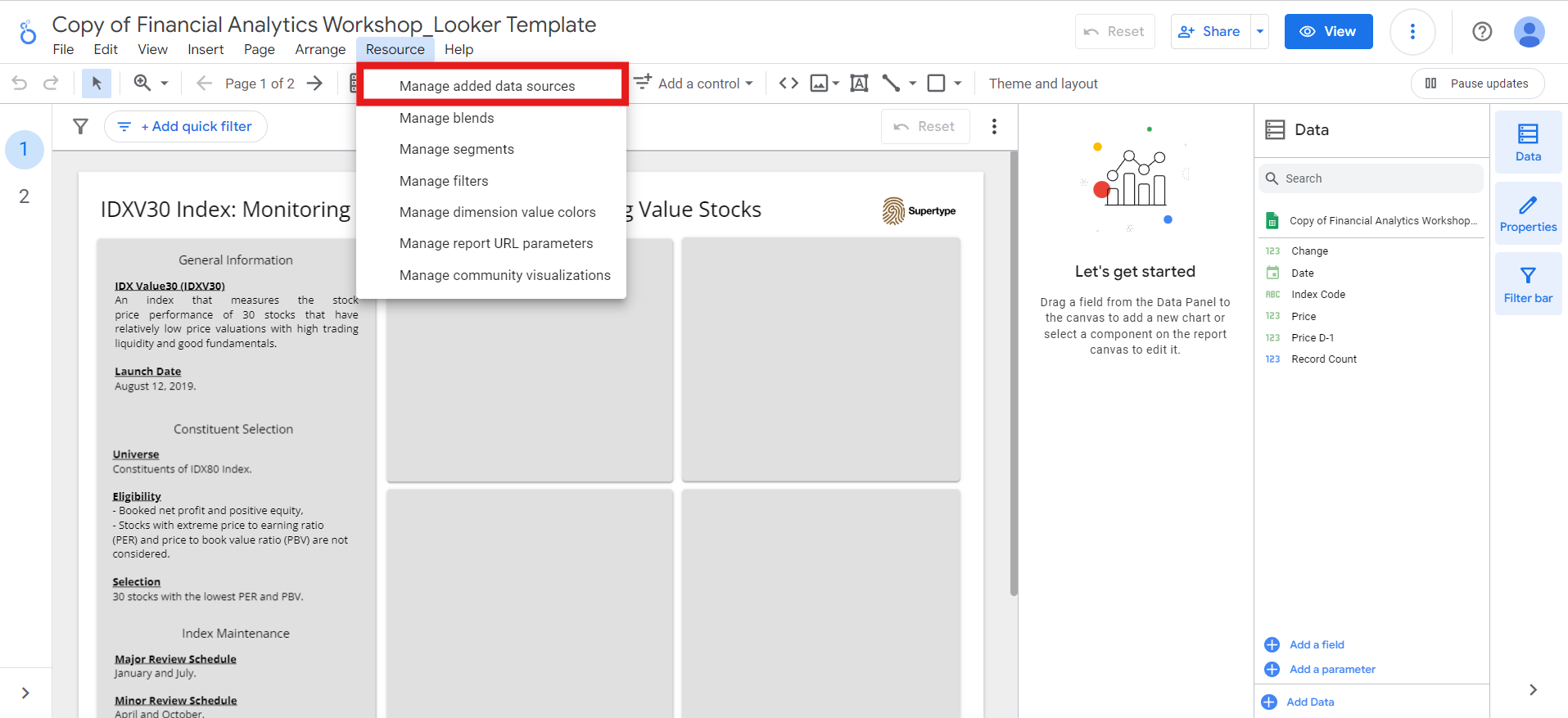
Overview data. To do this, click the Edit button next to the Overview data source.
Then, choose the right data type for each of the field, and click Done:
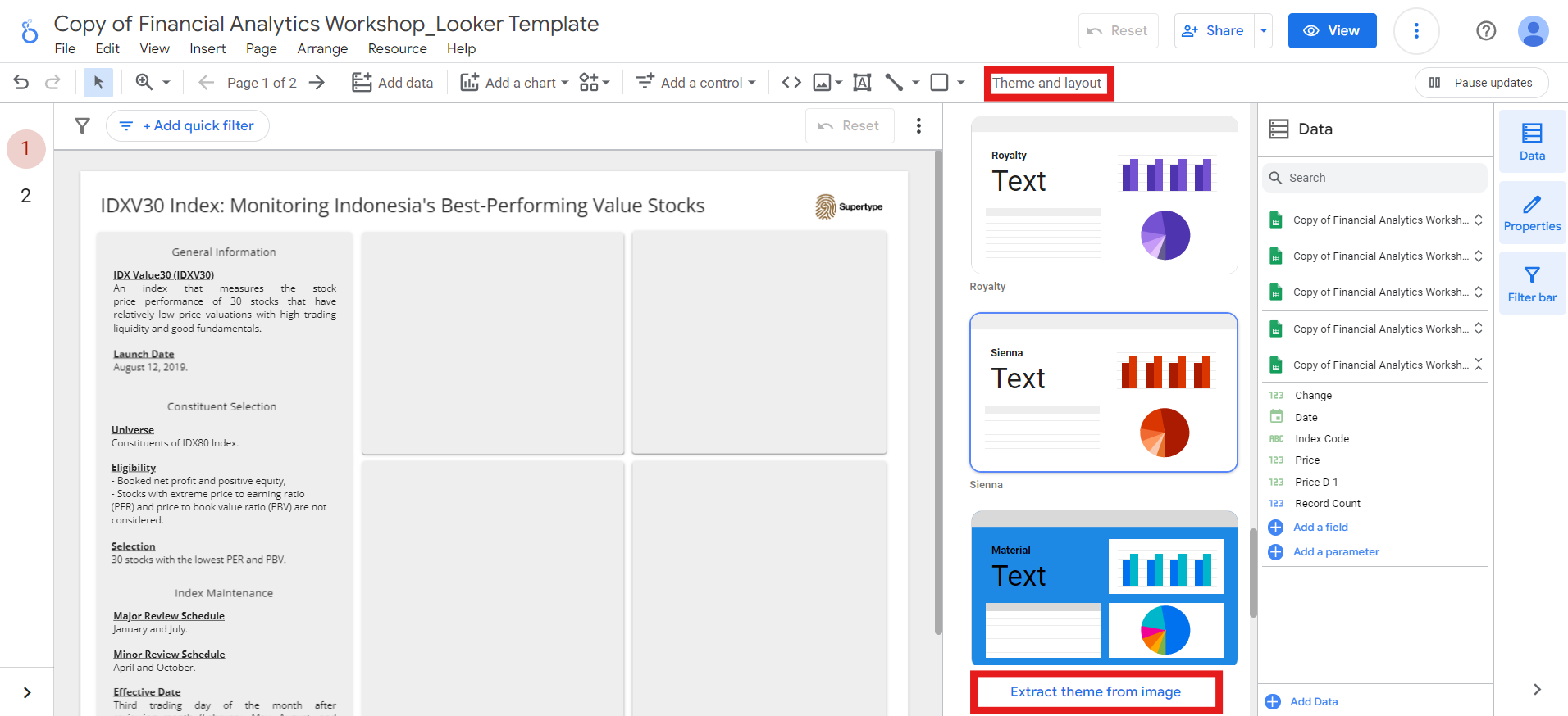
Managing theme, layout, and page in Looker Studio
Before creating visualizations for our dashboard, let’s first select the theme and layout we want to use. Open theTheme and layout menu and choose a theme that suits your design preferences. You can even extract a theme from any image of your choice, by clicking the Extract theme from image button.
Customize button next to the Current Theme:
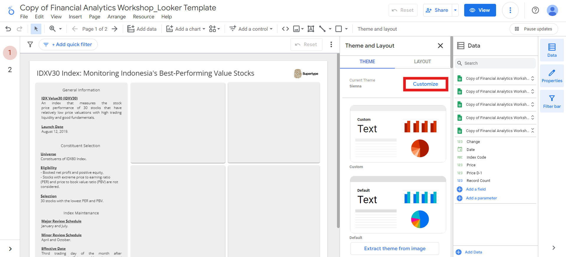
Open Sans.
Next, you can adjust the layout of your dashboard in the Layout section. There are several options you can customize, including:
-
View Mode: control how your dashboard appears in View mode, which you can access by clicking the
Viewbutton next to theSharebutton.- I typically set the
Header visibilitytoInitially hiddenso users can focus on the dashboard content immediately upon opening it. Header is the section that contains things like the report title, the share button, and edit button. - I prefer
TabNavigation because I find it provides a cleaner and more organized appearance. - And to ensure my report is responsive, I usually set the
Display modetoFit to width.
- I typically set the
- Canvas Size: controls the width and height of your report on the screen, allowing you to customize its dimensions.
-
Snap To: helps you easily layout the components of your report.
Smart guides: display colored lines to assist in aligning, resizing, and spacing the selected components.Grid: Aligns the selected components to the visible grid on the report canvas for precise positioning.
-
Grid Settings: controls the grid size. To show or hide the grid on the report canvas, go to
View>View gridmenu. -
Report-level Component Position: Determines how report-level components (those set to display on all pages) interact with other components on the page.
Top: positions report-level components in front of all other components (similar to theBring to frontsetting).Bottom: positions report-level components behind all other components (similar to theSend to backsetting).
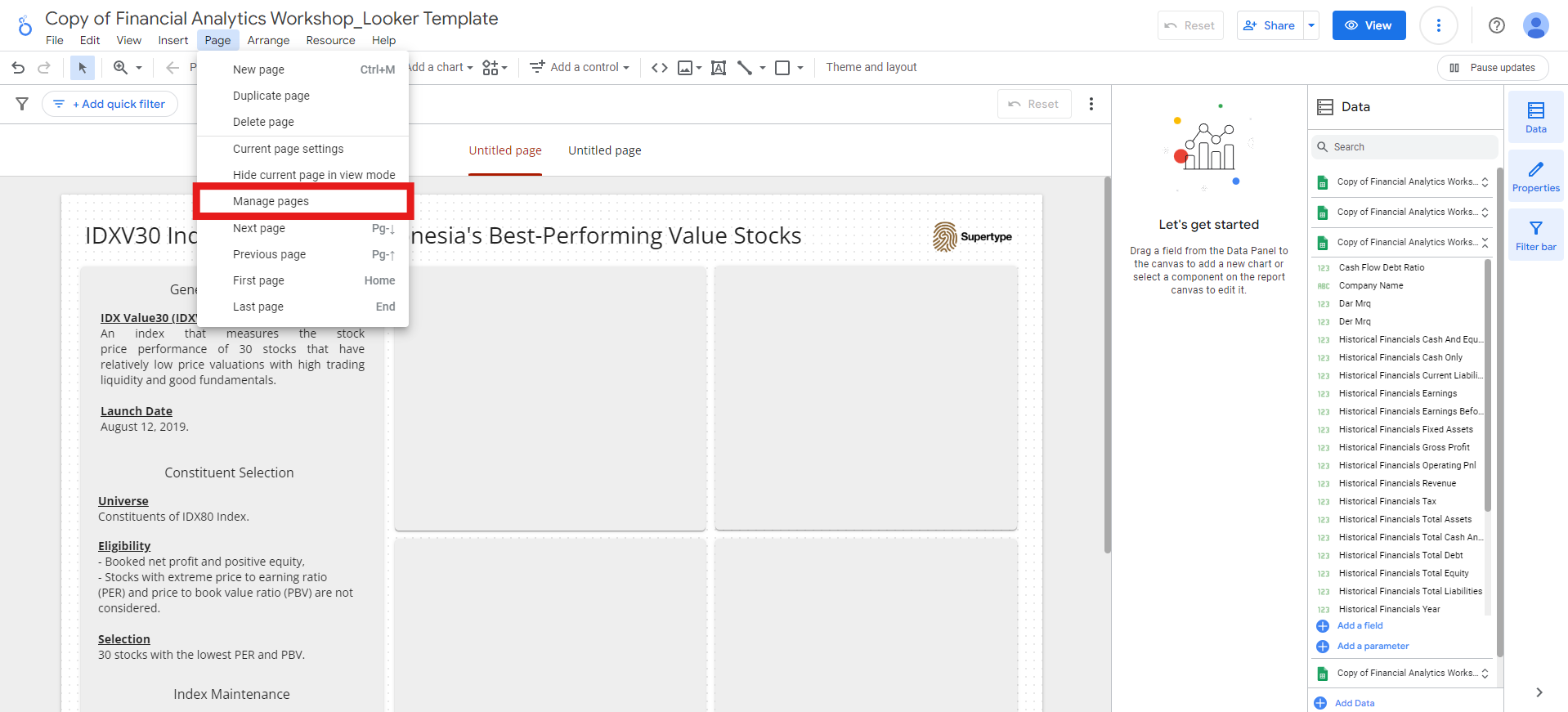
Page > Manage pages menu:
Connecting multiple data sources and creating visualizations
Now that the data and layout are set up, let’s begin creating the visualizations!IDXV30 overview
In this first section, we’ll create visualizations that provide an overview of the IDXV30. The data used will come from theIndex, Overview, and Valuation sheets.
We’ll also combine data from these sheets to generate the visualizations.
30 days performance
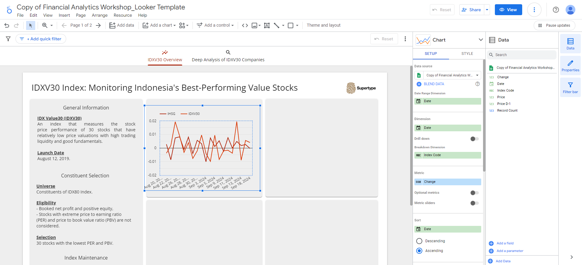
The first visualization will show the index price change over the last 30 days compared to IHSG, using data from theIndex sheet.
This is a key metric to analyze when assessing the performance of a stock index in IDX.
-
Go to
Add a chart>Line chartmenu: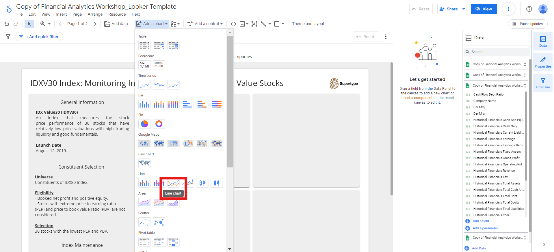
- Place the line chart in the top left square.
-
Choose the
Indexsheet as the data source, and set the fields as follows:- Dimension:
Date - Breakdown Dimension:
Index Code - Metric:
Change - Sort:
Date, ascending
Price D-1data for that day. To improve the chart’s appearance, let’s filter out the null value by adding a filter: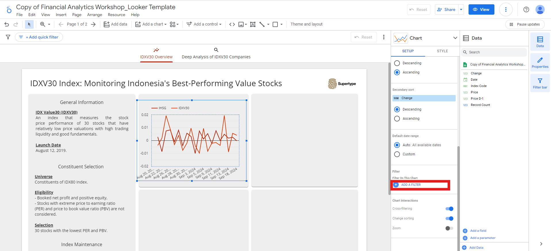
ChangefieldIs Null, and click theSavebutton: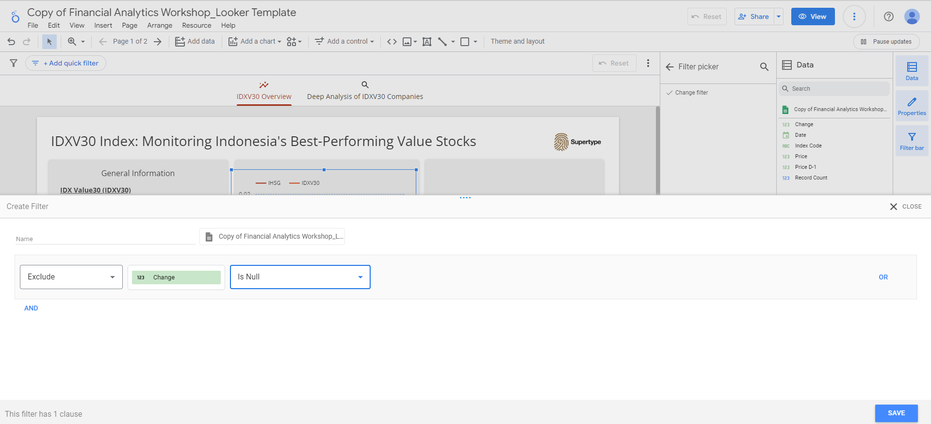
- Dimension:
-
You can also adjust the data or display format of each field by clicking the edit button next to the field name:
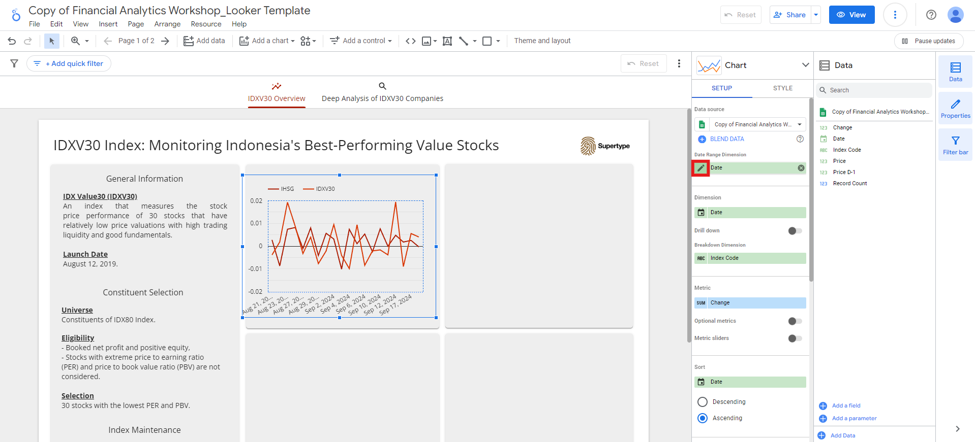
-
For the
Date, I prefer to change its display format toDate (- separator)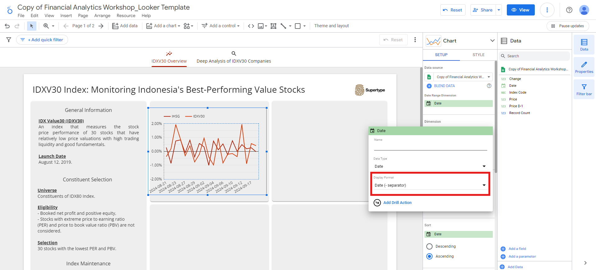
-
While for the
Change, I prefer to change its data type toPercent, its display format toPercent(2), and rename it toPrice Change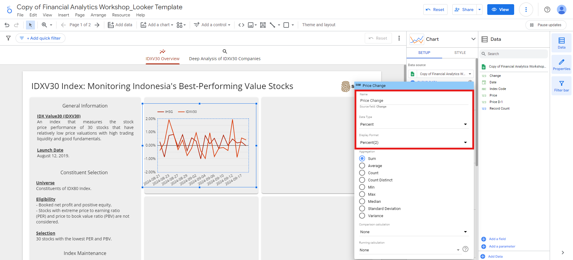
-
For the
-
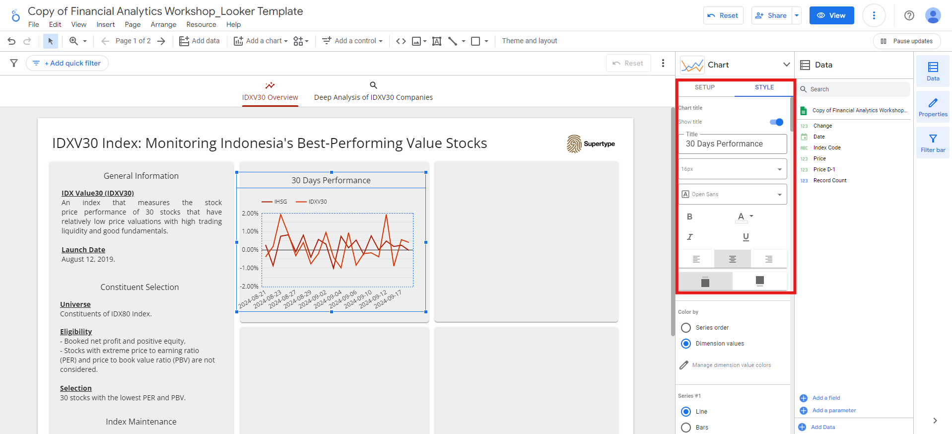
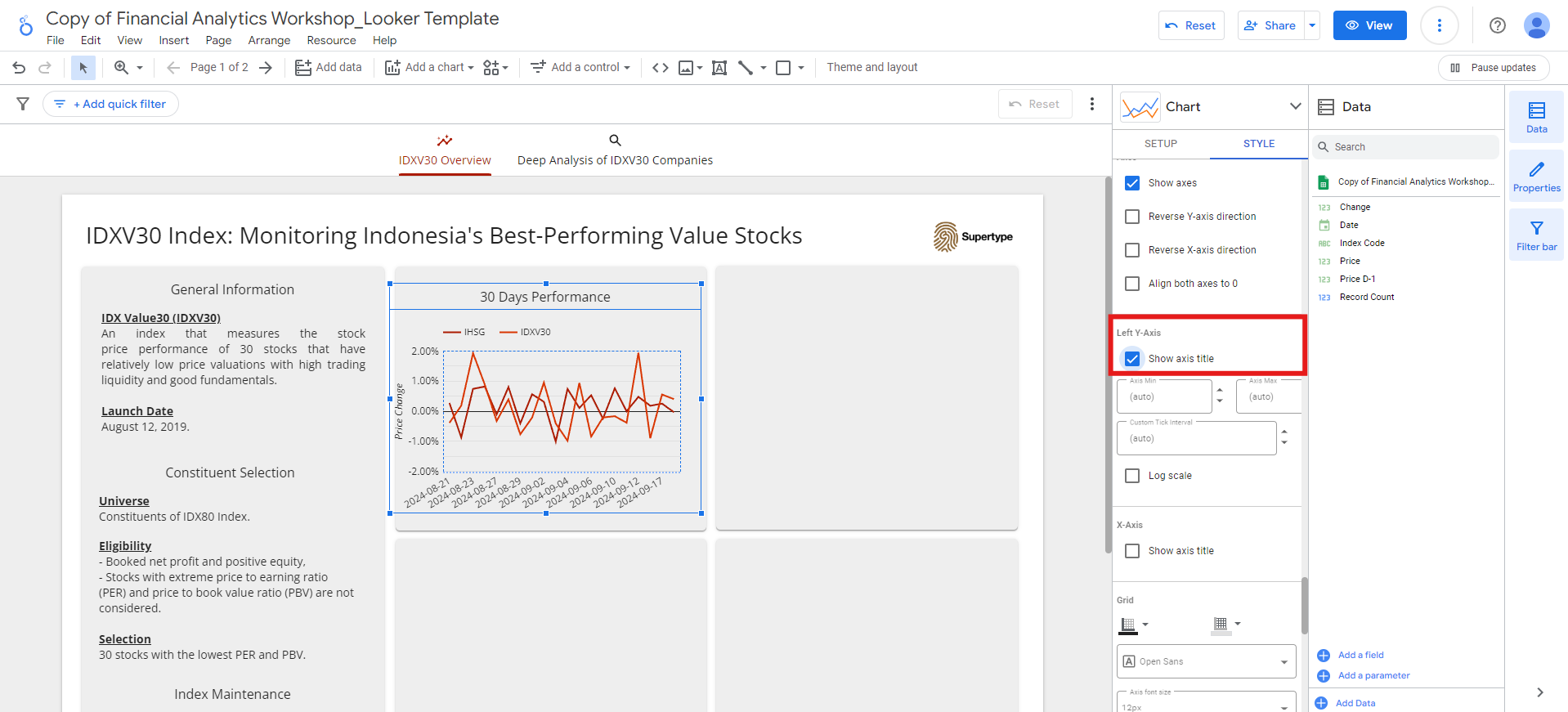
Lastly, add a title to the chart:
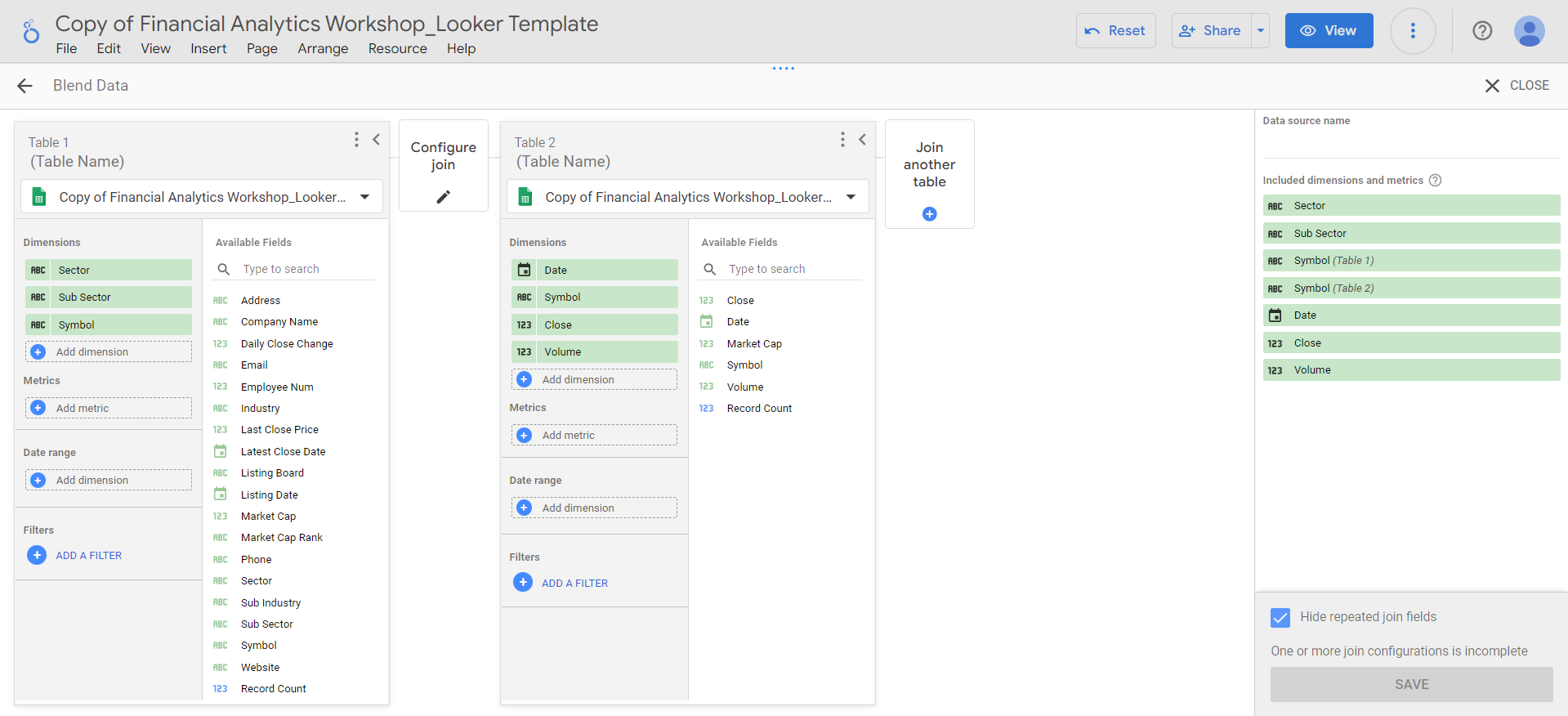
Combining Overview and Valuation sheets
The remaining visualizations in this IDXV30 Overview section will be based on data from the Overview and Valuation sheets.
To do this, we first need to combine the two datasets. Thankfully, Looker Studio offers an easy way to combine multiple data sources using blends.
Follow these steps to create a blend:
-
Go to
Resource>Manage blendsmenu: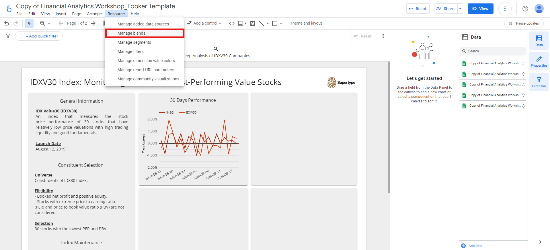
-
Click the
Add a blendbutton. -
Select the
Overviewsheet as Table 1. -
Click
Join another tableand choose theValuationsheet as Table 2. -
Select the following fields as Dimensions:
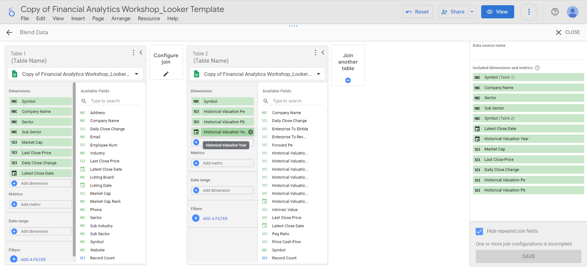
-
Since the
Valuationdata includes multiple years (2020–2024) in theHistorical Valuation Yearfield, we’ll add a filter to include only the 2024 valuation year:-
Click
Add a filter>Create a filtermenu of the Table 2: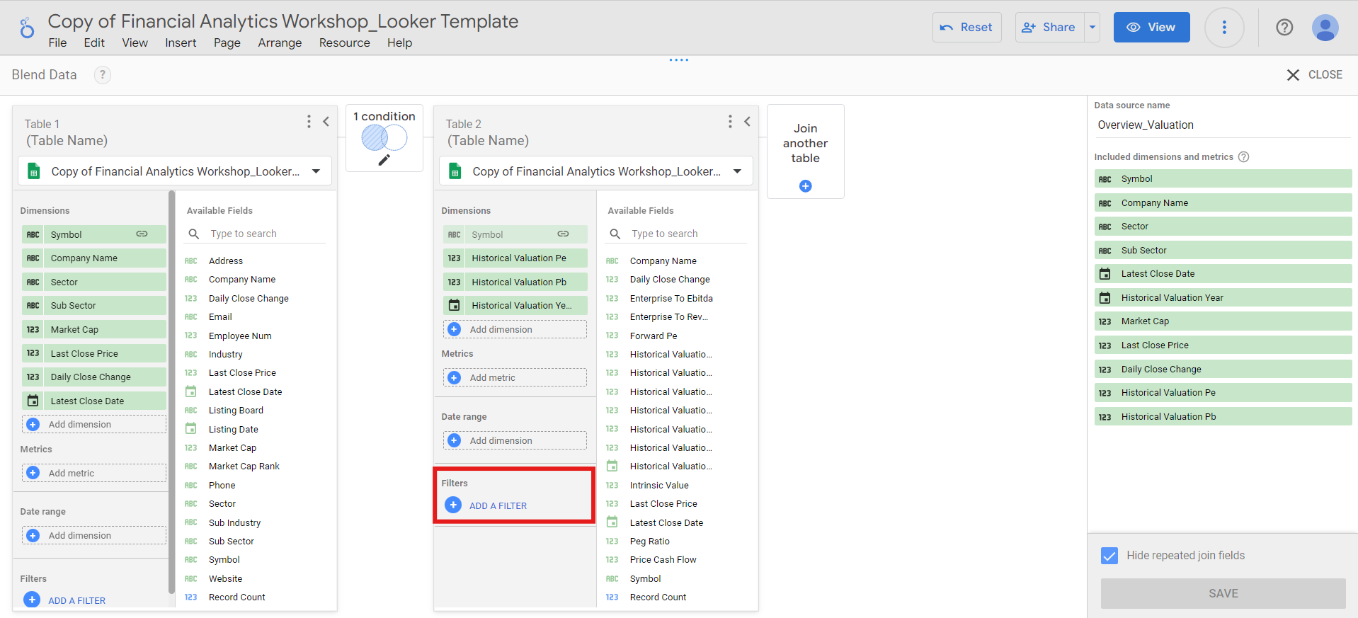
-
Then, set the filter to include
Historical Valuation Yearfield that is equal to2024and click theSavebutton: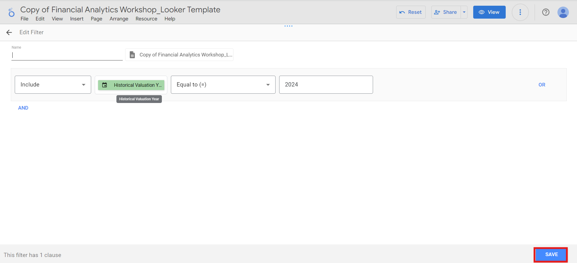
-
Click
-
Click the
Configure joinbutton and select theLeft outerjoin operator. Ensure the join condition is set to theSymbolfield for both tables, and clickSave. -
Add the data source name, hide repeated join fields, and click the
Savebutton: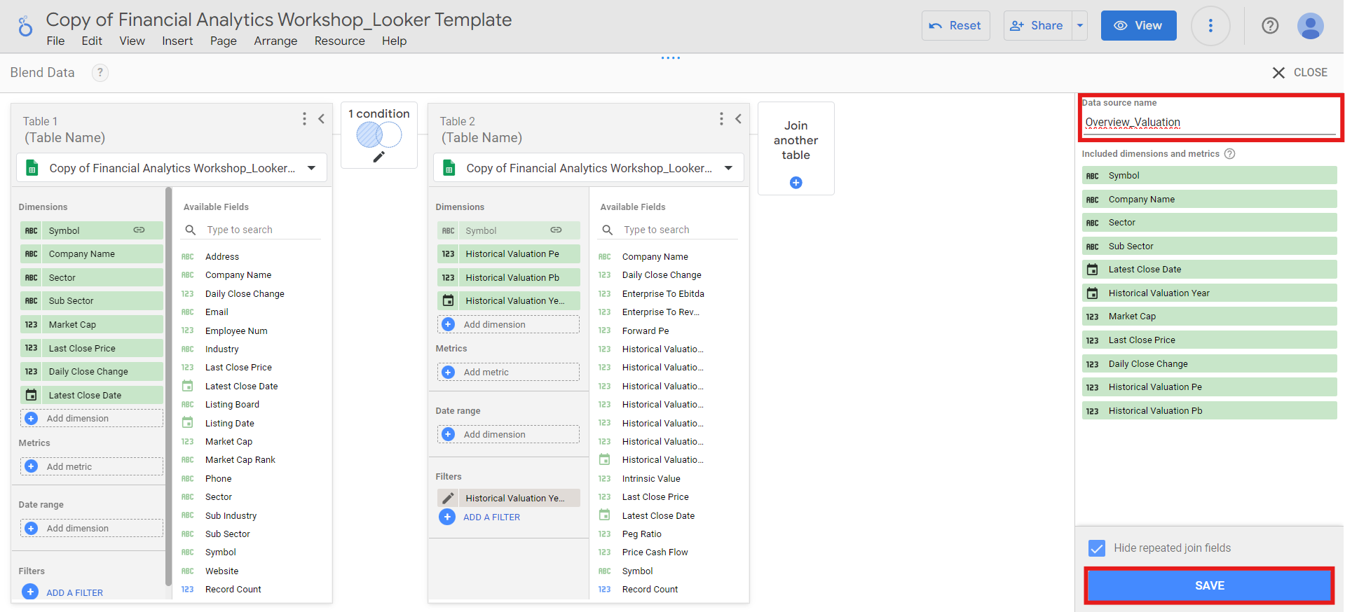
-
After the blend is saved, click the
Closebutton on the top right.
IDXV30 index composition
Next, we’ll use a treemap to visualize the composition of sectors, subsectors, and companies based on market capitalization and number of companies in the IDXV30 index:-
Go to
Add a chart>Treemapmenu and place the treemap in the top right square. -
Select the
Overview_Valuationblend as the data source, and set the fields as follows:- Dimension:
Sector,Sub Sector,Company Name - Level to show:
2 - Metric:
Market Cap
SectorandSub Sectoronly. To access theCompany Namedata within the chart, apply the drill down feature: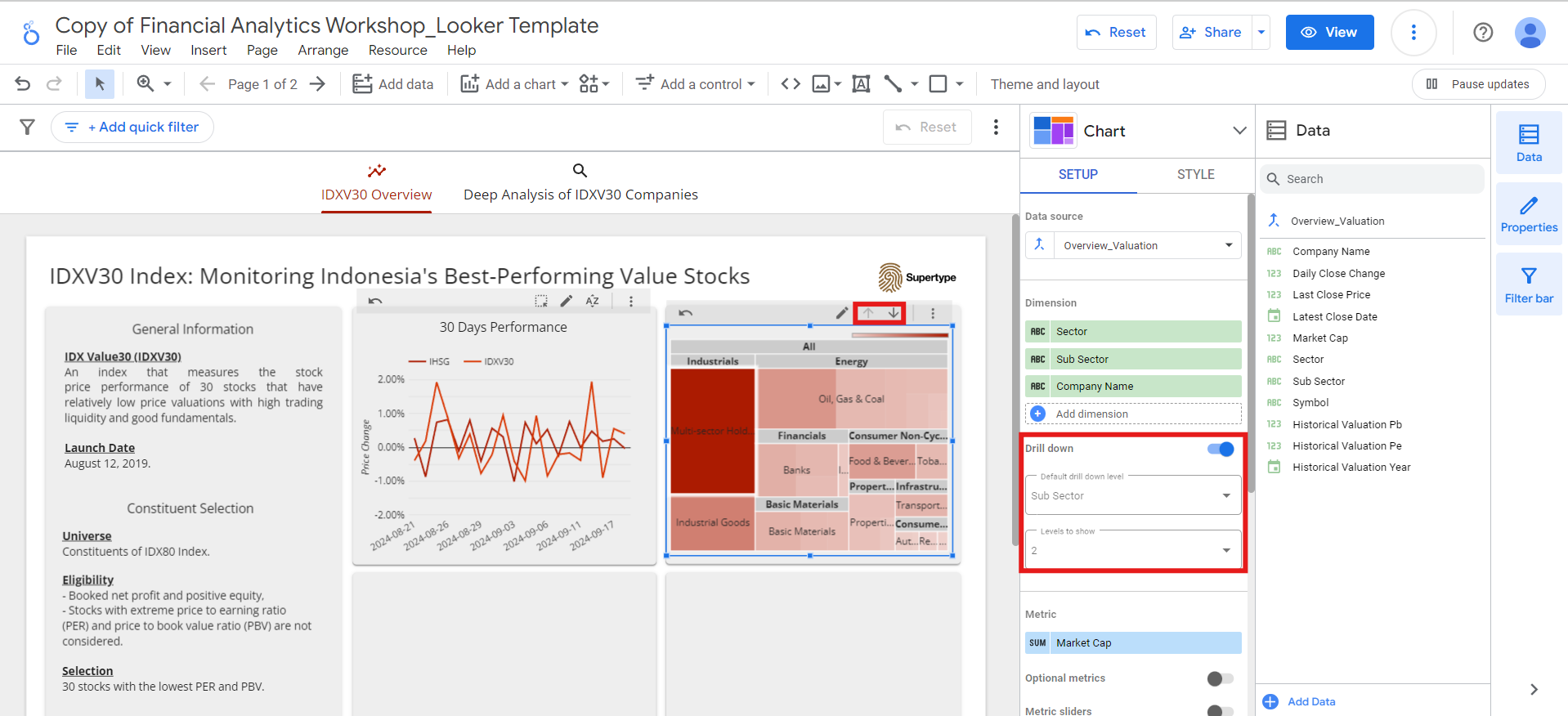
- Dimension:
-
We’ll also add an optional metric so that the index composition can be analyzed not only by market capitalization but also by the number of companies:
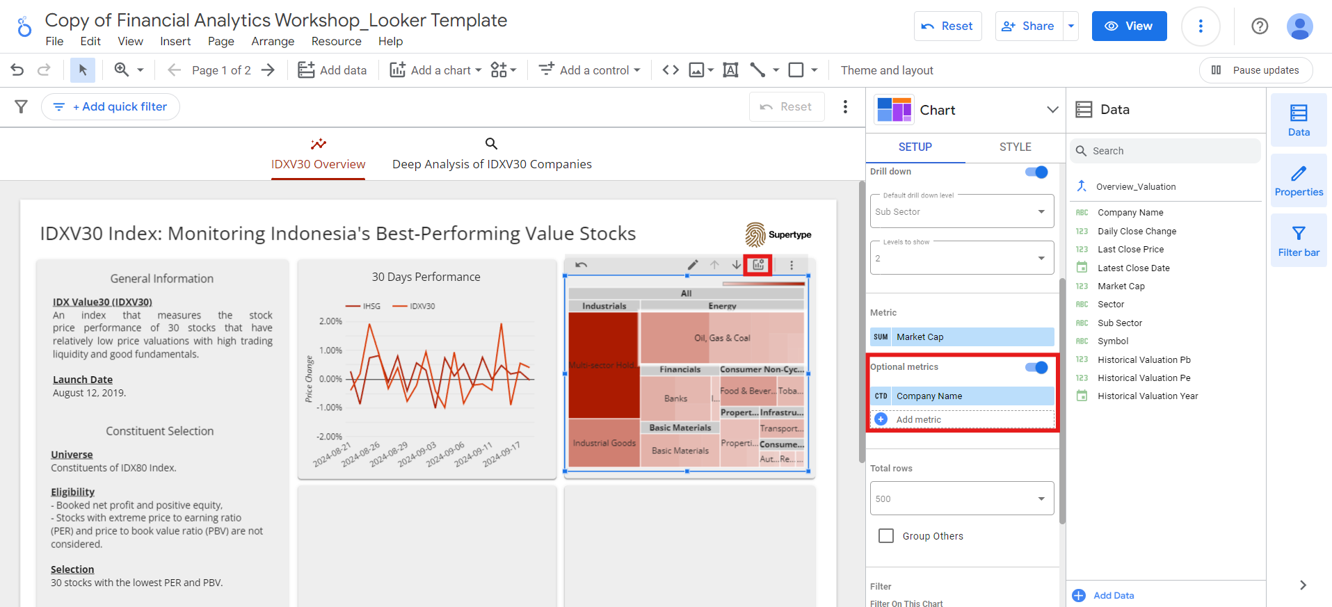
Company Nameoptional metric toNumber of Companiesfor better clarity: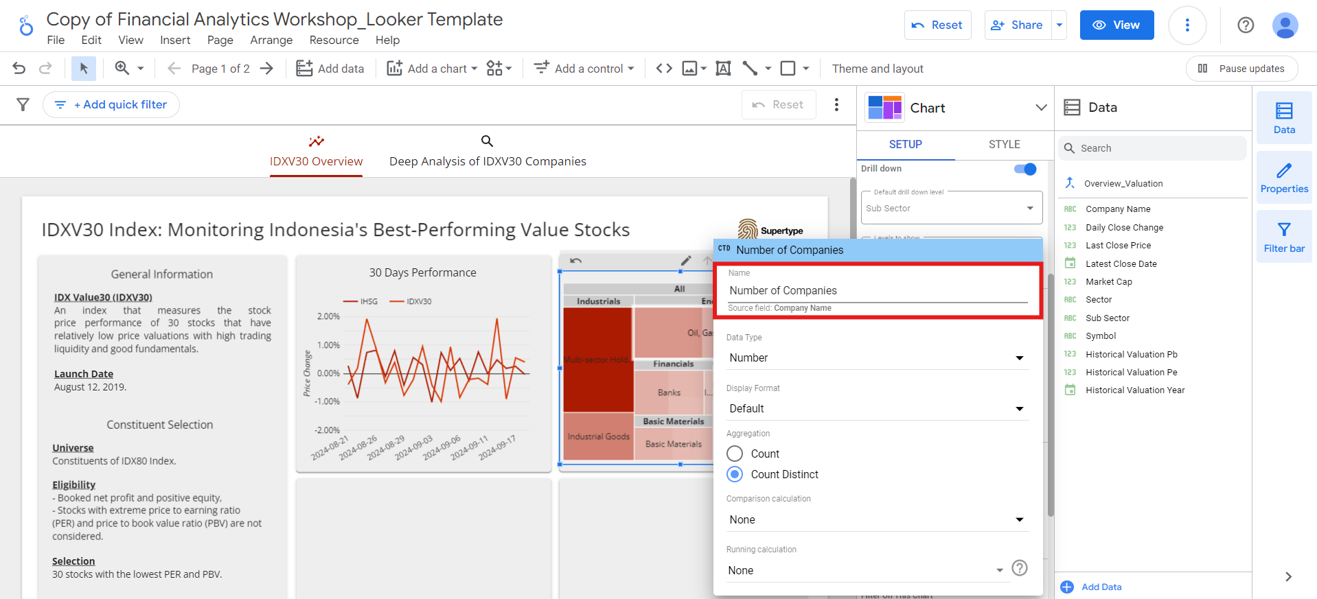
-
Finally, add
IDXV30 Index Compositiontitle to the chart, following the same method we used for the previous chart.
Top 5 constituents based on PE and PBV ratios
Since the IDXV30 index is composed of 30 stocks selected for having the lowest PE and PBV ratios, we’ll analyze the top 5 constituents based on these metrics. For the top 5 constituents with the lowest PE ratio:-
Go to
Add a chart>Bar chartmenu and place the bar chart in the bottom left square. -
Select the
Overview_Valuationblend as the data source, and set the fields as follows:- Dimension:
Symbol - Metric:
Historical Valuation Pe(rename it toPE Ratio) - Sort:
Historical Valuation Pe, ascending
- Dimension:
-
To display only the top 5 constituents, limit the number of bars in
Style>Barsto 5:
-
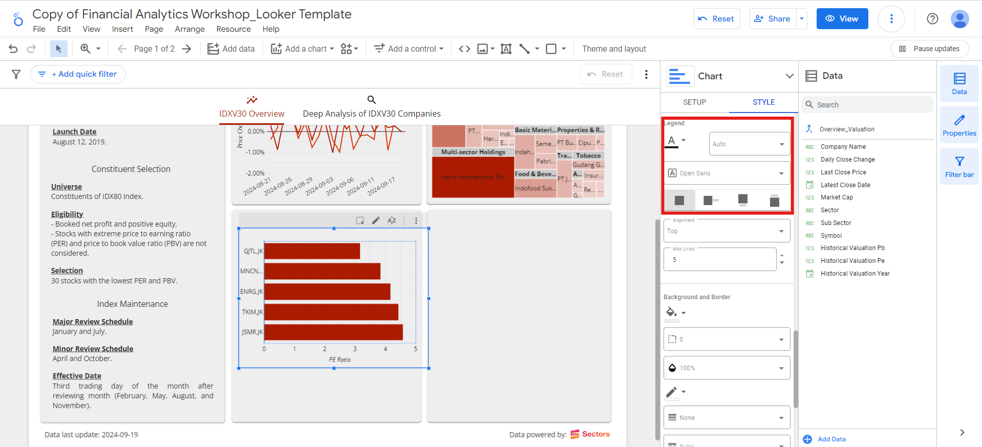
Then, show the x-axis title and hide the legend:
Historical Valuation Pe field to Historical Valuation Pb field and rename it to PBV Ratio.
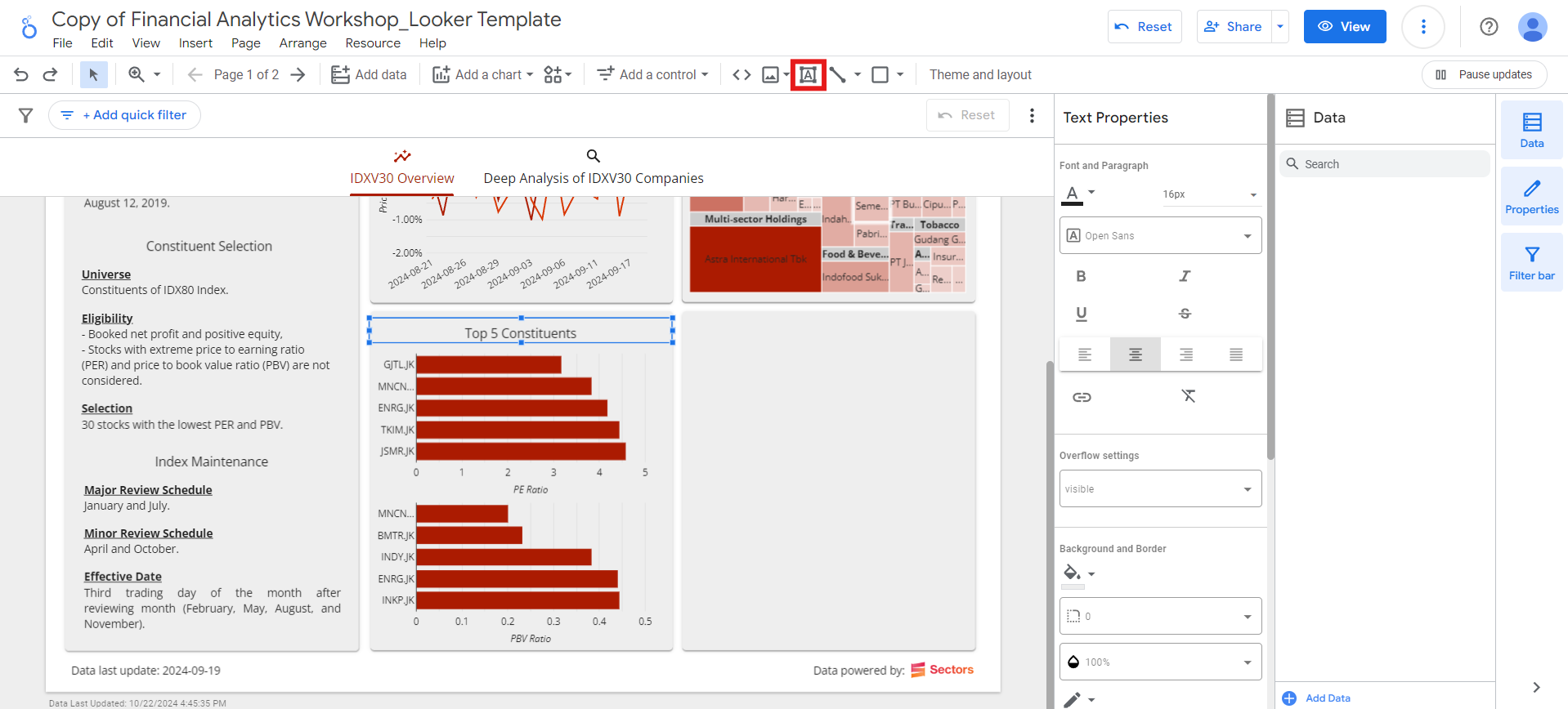
Finally, add a text box on top of the 2 charts, to display the Top 5 Constituents title:
Top 5 daily gainers and losers
The last square of the IDXV30 Overview page will display tables for the top 5 daily gainers and losers. For the top 5 daily gainers:-
Go to
Add a chart>Table with heatmapmenu: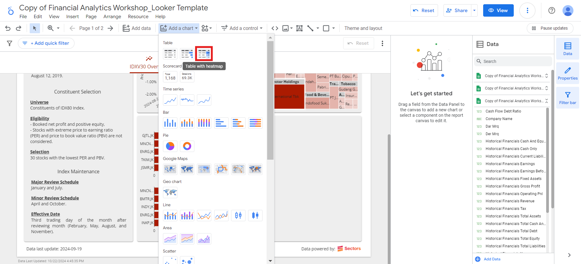
- Place the table in the bottom right square.
-
Select the
Overview_Valuationblend as the data source, and set the fields as follows:-
Dimension:
Symbol,Last Close Price(rename it toLatest Close, change its data type toCurrency (IDR), and its display format toNumber(0)) -
Metric:
Daily Close Change(rename it toDaily Changeand change its data type toPercent) -
Number of Rows:
Top N>Top rows = 5: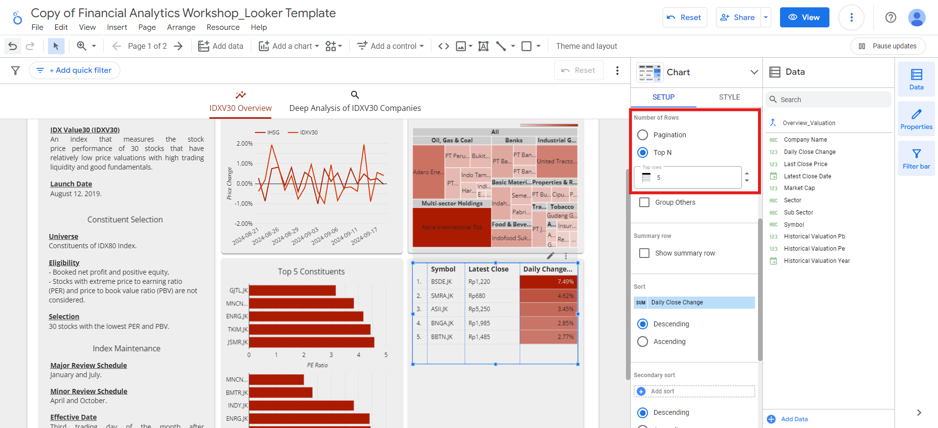
-
Sort:
Daily Close Change, descending
-
Dimension:
-
Add
Top 5 Daily Gainerstitle to the table.
- Copy and paste the top 5 daily gainers table.
- Change the Sort order to ascending.
-
Rename the title to
Top 5 Daily Losers.
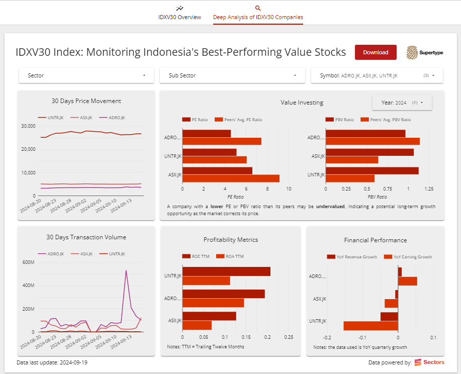
Deep analysis of IDXV30 companies
In this section, we’ll create visualizations that offer a deeper analysis of IDXV30 companies. The data will come from theOverview, Daily Data, Valuation, and Financials sheets.
We’ll also combine data from these sheets to produce meaningful insights through various visualizations.
30-day price movement & transaction volume
Analyzing the 30-day price movement and transaction volume helps us understand short-term market trends and investor sentiment for IDXV30 companies. Price fluctuations over this period can reveal patterns in market behavior, while transaction volume highlights the intensity of trading activity. Before creating the visualization, we’ll first create a blend to combineOverview and Daily Data sheets:
-
Go to
Resource>Manage blendsmenu and click theAdd a blendbutton. -
Select the
Overviewsheet as Table 1. -
Click
Join another tableand choose theDaily Datasheet as Table 2. -
Select the following fields as Dimensions:
-
Click the
Configure joinbutton and select theLeft outerjoin operator. Ensure the join condition is set to theSymbolfield for both tables, and clickSave. -
Add the data source name:
Overview_Daily, hide repeated join fields, and click theSavebutton. -
After the blend is saved, click the
Closebutton on the top right.
-
Go to
Add a chart>Line chartmenu and place the line chart in the top left square. -
Choose the
Overview_Dailyas the data source, and set the fields as follows:- Dimension:
Date(change its display format toDate (- separator)) - Breakdown Dimension:
Symbol - Metric:
Close(change its data type toCurrency (IDR)and its display format toNumber (0)) - Sort:
Date, ascending
- Dimension:
-
You’ll notice that the chart appears crowded due to the large number of symbols.
To simplify the view, we can limit the number of displayed lines to a maximum of 5.
To do this, go to
Style>Number of Series, and set it to5 series: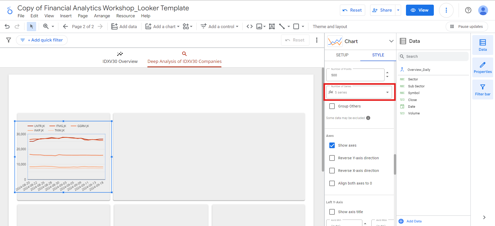
-
Add the
30 Days Price Movementtitle to the chart.
Close to Volume.
This will show the transaction volumes over the past 30 days. Then, rename the chart title to 30 Days Transaction Volume.
Place this chart in the bottom left square.
Value investing
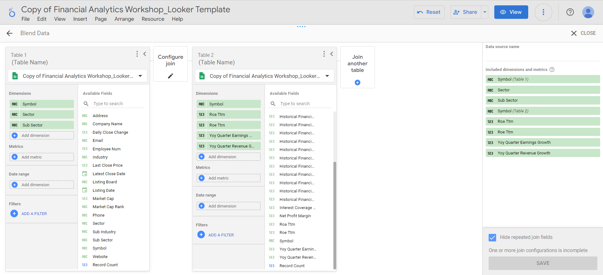
Next, we’ll dive into the value investing analysis, focusing on identifying undervalued stocks. This is done by comparing two key financial metrics: PE (Price to Earnings) and PBV (Price to Book Value) ratios. By evaluating each company’s PE and PBV ratios against the average ratios of its peer group, we can uncover stocks that are potentially trading at a discount. These lower valuations, relative to peers, may signal investment opportunities where the market has underpriced fundamentally strong companies with growth potential. First, we’ll create a new blend betweenOverview and Valuation sheets:
-
Go to
Resource>Manage blendsmenu and click theAdd a blendbutton. -
Select the
Overviewsheet as Table 1. -
Click
Join another tableand choose theValuationsheet as Table 2. -
Select the following fields as Dimensions:
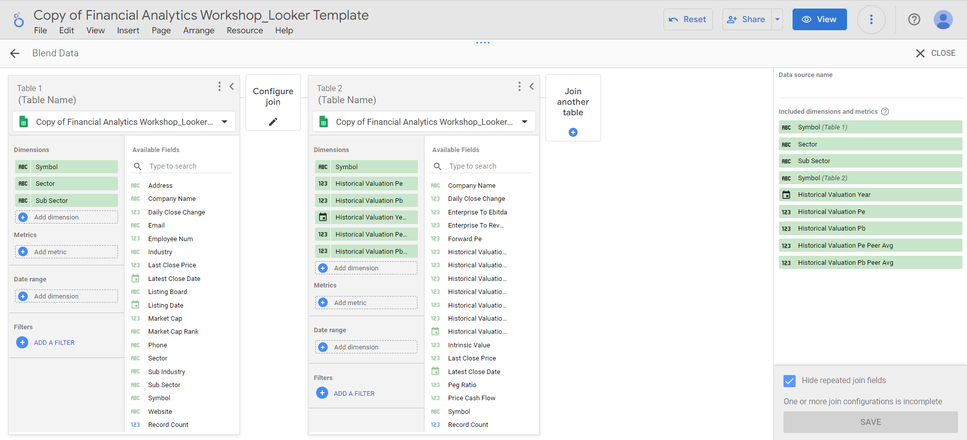
Historical Valuation Yearin the blend. Instead, we’ll allow users to select the year they want to view in the dashboard. -
Click the
Configure joinbutton and select theLeft outerjoin operator. Ensure the join condition is set to theSymbolfield for both tables, and clickSave. -
Add the data source name:
Deep_Valuation, hide repeated join fields, and click theSavebutton. -
After the blend is saved, click the
Closebutton on the top right.
-
Go to
Add a chart>Bar chartmenu and place the bar chart in the top right square. -
Select the
Deep_Valuationblend as the data source, and set the fields as follows:- Dimension:
Symbol - Metric:
Historical Valuation Pe(rename it toPE Ratio),Historical Valuation Pe Peer Avg(rename it toPeers' Avg. PE Ratio) - Sort:
Historical Valuation Pe, ascending
- Dimension:
-
Limit the number of bars in
Style>Barsto 5 as before. - Then, show the x-axis title.
Historical Valuation Pb (rename it to PBV Ratio) and Historical Valuation Pb Peer Avg (rename it to Peers' Avg. PBV Ratio).
At this point, you may notice that the PE and PBV ratios displayed in the charts are currently showing the sum of the 2020-2024 ratios, which leads to incorrect information.
To address this, we’ll add a filter that enables users to select the specific year they wish to display, ensuring accurate and relevant data:
-
Go to
Add a control>Drop-down listmenu: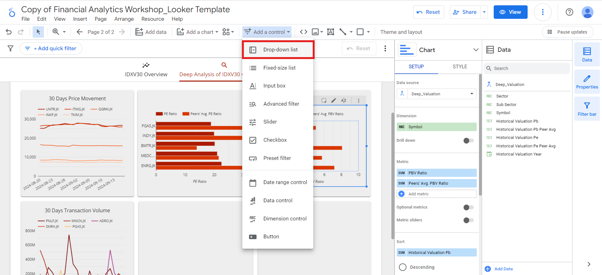
- Place the filter above the PBV ratio chart.
-
Select the
Deep_Valuationblend as the data source, and set the fields as follows:- Control Field:
Historical Valuation Year(rename it toYear) - Default Selection:
2024 - Metric: -
- Order:
Historical Valuation Year, descending
- Control Field:
-
Since we only want the user to be able to select one year at a time, go to the
Stylemenu and tick theSingle-selectoption.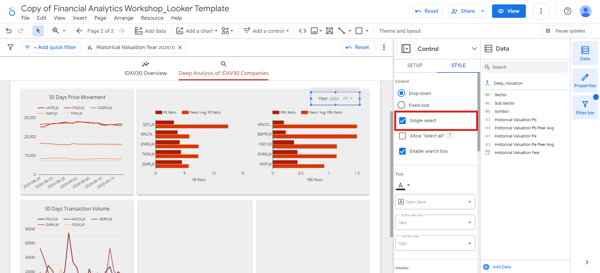
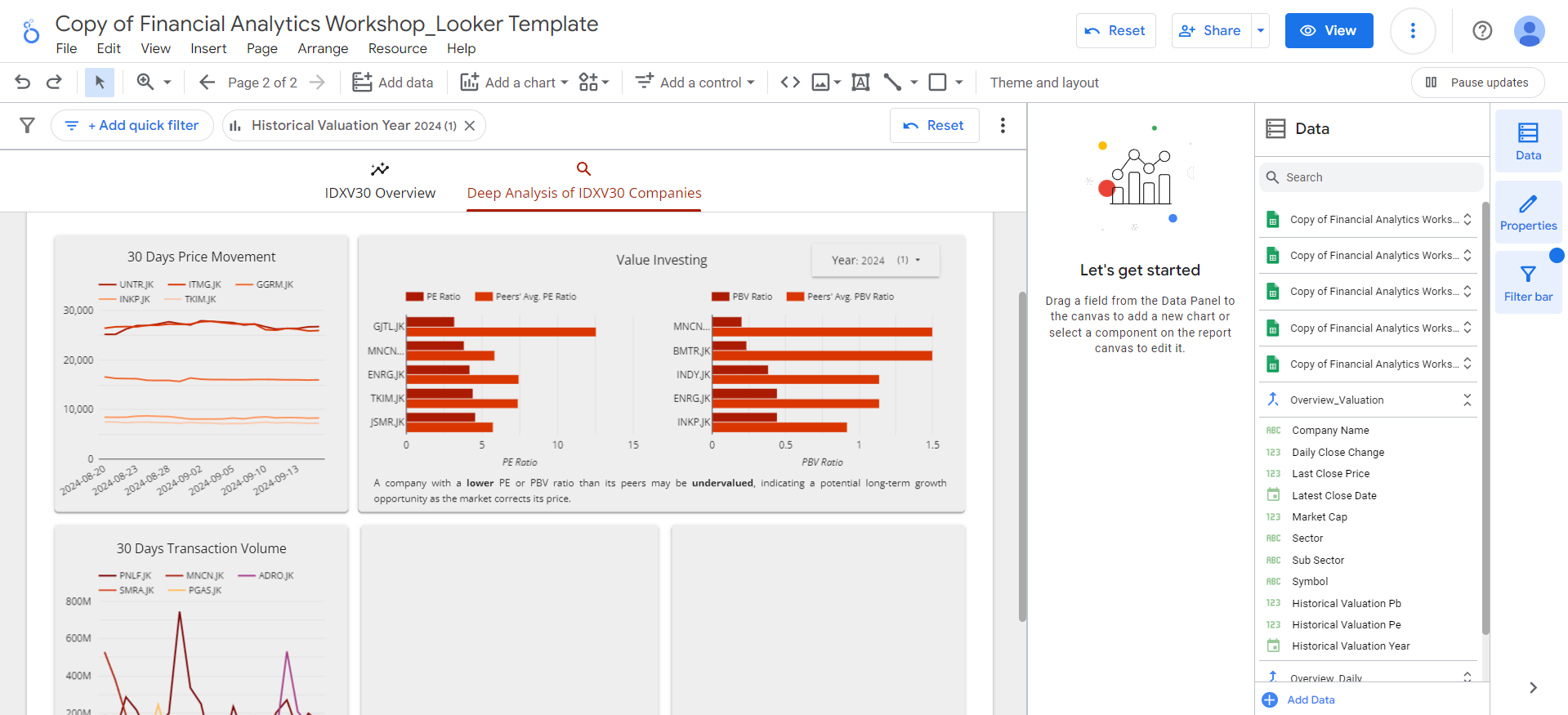
Value Investing title above both charts, and beneath them, include the following explanatory text:
Profitability metrics and financial performance
In this section, we focus on analyzing key profitability and financial performance metrics such as ROE (Return on Equity), ROA (Return on Assets), and YoY (Year-over-Year) revenue and earnings growth. These metrics are essential for evaluating how efficiently a company is using its resources to generate profit and how well it is growing over time. We will create a blend to joinOverview and Financials sheets before creating the visualizations:
-
Go to
Resource>Manage blendsmenu and click theAdd a blendbutton. -
Select the
Overviewsheet as Table 1. -
Click
Join another tableand choose theFinancialssheet as Table 2. -
Select the following fields as Dimensions:
-
Add a filter to exclude any rows where the
Symbolfield is null: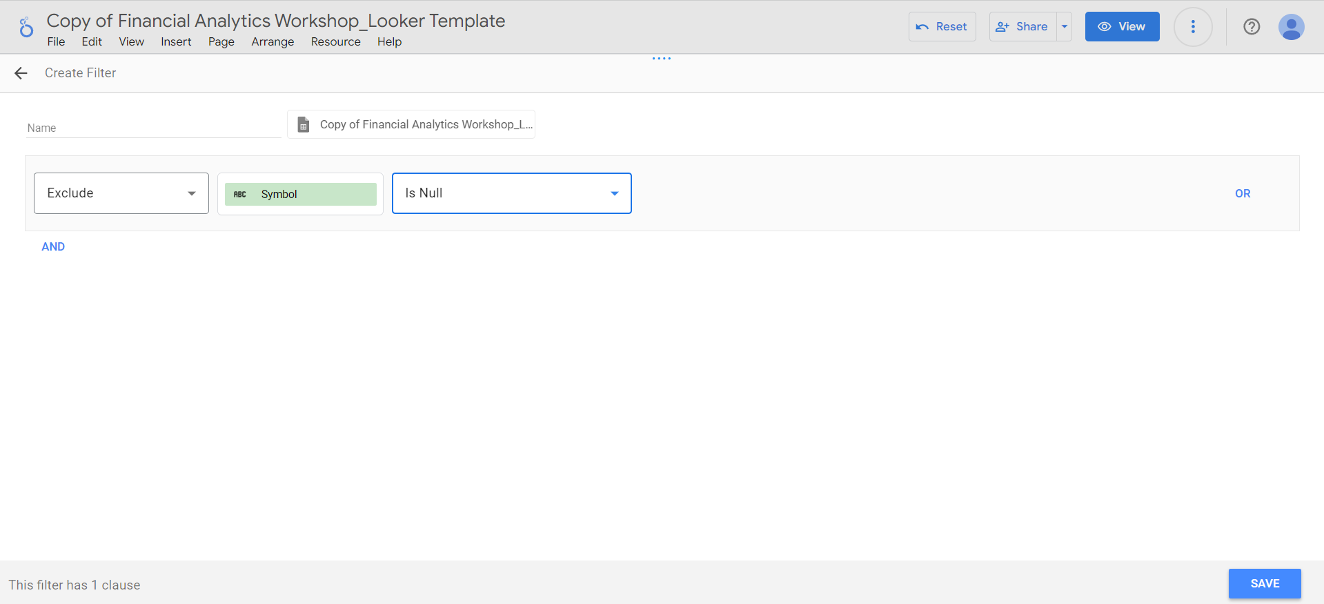
-
Click the
Configure joinbutton and select theLeft outerjoin operator. Ensure the join condition is set to theSymbolfield for both tables, and clickSave. -
Add the data source name:
Overview_Financials, hide repeated join fields, and click theSavebutton. -
After the blend is saved, click the
Closebutton on the top right.
-
Go to
Add a chart>Bar chartmenu and place the bar chart in the bottom left square. -
Select the
Overview_Financialsblend as the data source, and set the fields as follows:- Dimension:
Symbol - Metric:
Roe Ttm(rename it toROE TTM),Roa Ttm(rename it toROA TTM) - Sort:
Roe Ttm, descending
- Dimension:
-
Limit the number of bars in
Style>Barsto 5 as before. -
Add a
Profitability Metricstitle to the chart and add this note under the chart:
- Dimension:
Symbol - Metric:
Yoy Quarter Revenue Growth(rename it toYoY Revenue Growth),Yoy Quarter Earnings Growth(rename it toYoY Earning Growth) - Sort:
Yoy Quarter Revenue Growth, descending
Financial Performance and add the following note below the chart:
Adding filters to the dashboard
Now that all visualizations for this page are complete, let’s enhance the page by adding filters. These filters will allow users to customize their view by selecting specific sectors, sub sectors, or symbols. To create a sector filter:-
Navigate to
Add a control>Dropdown-listmenu and place the dropdown at the top of the dashboard. -
Set the data source to
Overview_Daily, and set the fields as follows:- Control Field:
Sector - Metric: -
- Sort:
Sector, ascending
- Control Field:
-
For the sub sector filter, select
Sub Sectoras the control field and place it next to the sector filter. -
For the symbol filter, select
Symbolas the control field and place it beside the sub sector filter. For this filter, also addADRO.JK, ASII.JK, UNTR.JKas the Default Selection: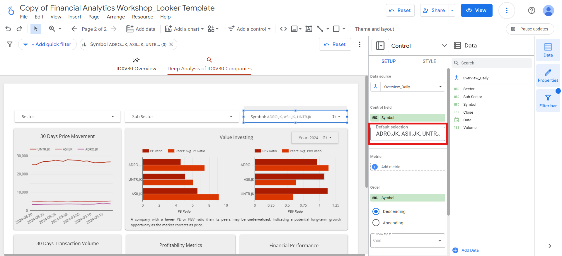
Report-level components and download button
To finalize the Deep Analysis of IDXV30 Companies page, we will incorporate some report-level components and a download button. Report-level components are elements that remain visible across all pages of the dashboard. In this case, these components will include the dashboard title, the Supertype logo, and the dashboard footer. We’ll also add a download button as a report-level component, ensuring that users can easily download the dashboard from any page they are viewing. This feature provides convenience and enhances user experience by enabling quick access to export options without navigating to a specific section. To add report-level components, let’s go back to the IDXV30 Overview page and follow these steps:- Right-click on the title of the report.
- Select the
Make report-leveloption from the dropdown menu.
-
Go to
Add a control>Buttonmenu and place the button next to the Supertype logo. -
Set the Button Action Type to
Report Actions. -
Then, set the Choose a Report Action for the Button to
Download report: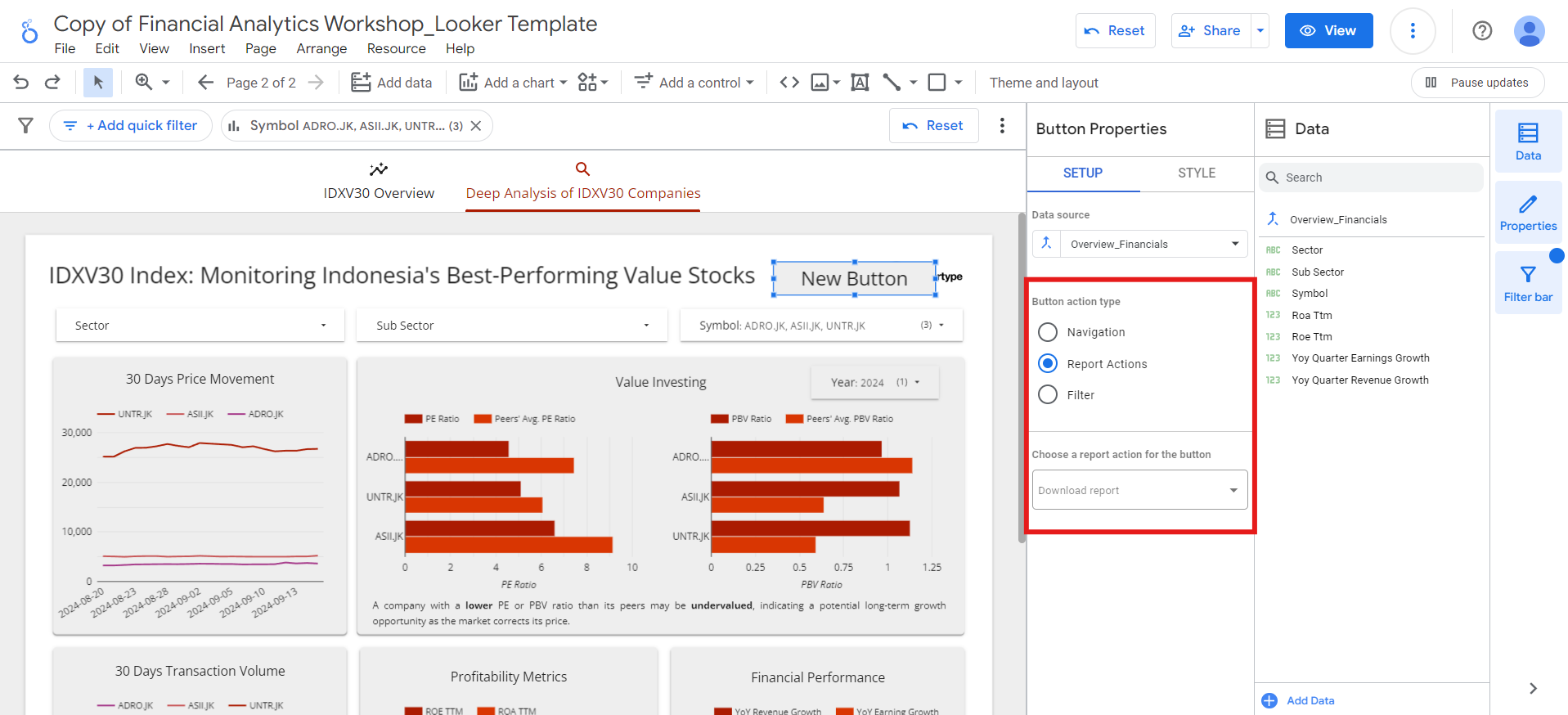
-
Double-click the button and rename the
New buttontoDownload. -
Set the font size, font color, and the background color on the
Stylemenu: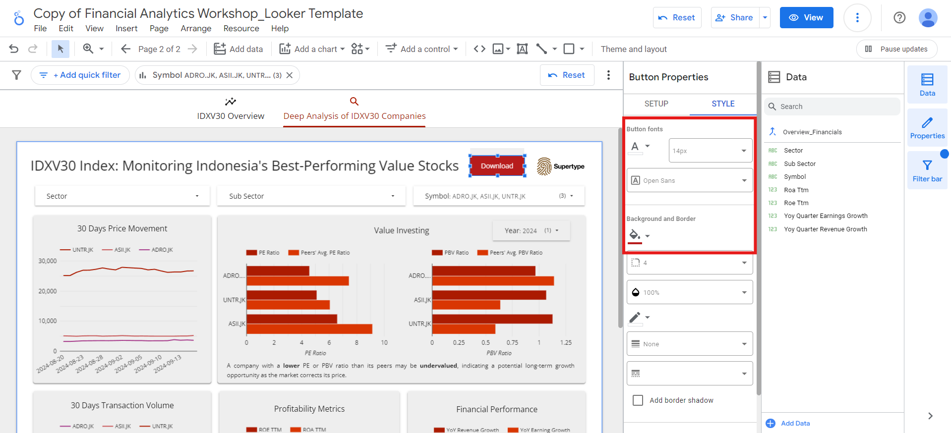
- Lastly, set the button as a report-level component.
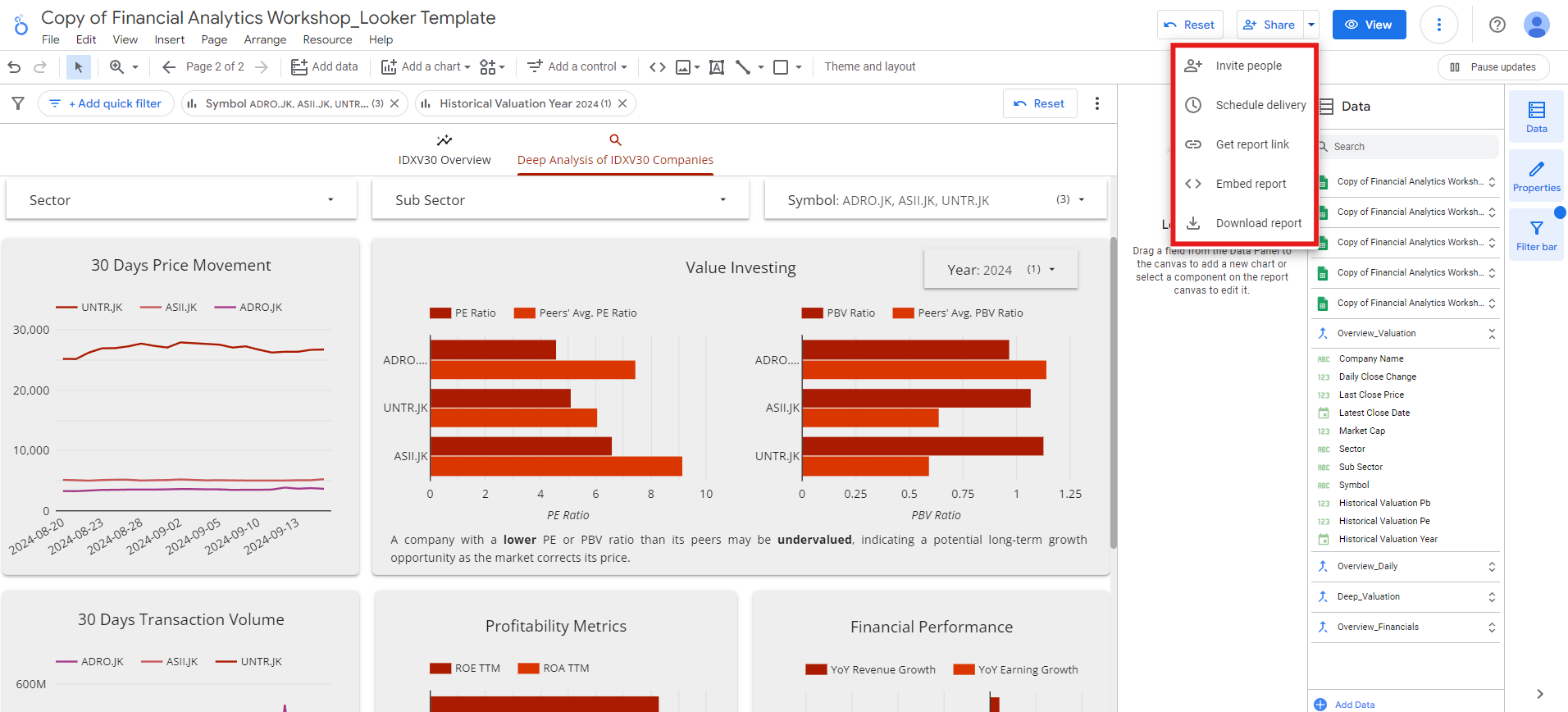
Sharing your dashboard
Once you’ve completed building the dashboard, it’s time to share it with others. Looker makes it easy to share your dashboard via email, embed it in websites, or generate shareable links for easy access. You can also schedule automatic email reports to keep stakeholders updated regularly. To do those things, you just have to open theShare menu and choose which action you want to take: