Suppose you have some spare cash—often referred to as “cold money”—that you’re looking to invest, particularly in the tobacco subsector, with a focus on companies financial. Naturally, you would need to examine the historical financial data of each potential investment, right? Well, relax; there’s no need to go through this process manually. With the Sectors Financial API, you can effortlessly access and visualize the necessary data!
In this recipe we will use a few API from Sectors, here are the following API:
List of Companies by Subsector API to retrieve all the companies in a subsector
Individual Company Report per Section API to retrieve the financial data for each company
Using this API we will get the data we need and do some nice visualization on it. You should take a look at List All Subsectors Recipe also if you need a simple example of data exploration on Sectors Financial API.
Let’s take a look at list of companies under the tobacco subsectors
Copy
import requestsimport altair as altimport pandas as pdAPI_KEYS = "Your API Keys"headers = { "Authorization": API_KEYS}response = requests.get("https://api.sectors.app/v1/companies/?sub_sector=tobacco", headers = headers)list_companies_by_subsectors = []if response.status_code == 200: data = response.json() for company in data: list_companies_by_subsectors.append(company["symbol"])else: # Handle error print("Error Status :",response.status_code)print(list_companies_by_subsectors)
You should see an output like this:
Copy
['GGRM.JK', 'HMSP.JK', 'ITIC.JK', 'WIIM.JK']
These are the list of all companies under one subsector which in this recipe, we use tobacco subsectors.
After retrieving the list of companies under the tobacco subsector, the next step is to obtain the financial report for each company. With the help of Sectors, you can easily access the Company Report, which provides comprehensive information beyond just financial. The available sections of the report include:
Overview
Valuation
Peers
Future
Financials
Dividend
Management
Ownership
But in this section, we will only cover the financials section, specifically the revenue and earning data, let’s retrieve the data and merge it into our previous data.
Copy
data = []for company in list_companies_by_subsectors: headers = { "Authorization": API_KEYS } response = requests.get(f"https://api.sectors.app/v1/company/report/{company}/?sections=financials", headers = headers) if response.status_code == 200: financial_report = response.json() for historical_financial in financial_report['financials']['historical_financials']: data.append([company,financial_report['company_name'], historical_financial['year'], historical_financial['revenue'], historical_financial['earnings']]) else: # Handle error print(response)
If you run the code and try to print the data the output should look like this
We now have access to both revenue and earnings data through a single API provided by Sectors! Sectors simplify the process of retrieving each company’s financial report. To explore the breadth of available data, you can interact with the API directly.
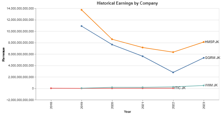
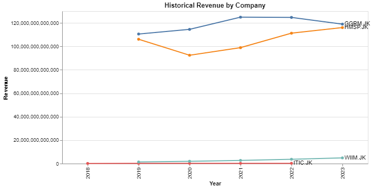
Since we already gathered the revenue and earnings data from each company, now let’s try to visualize and compare the revenue and earnings data from each company
Let’s take a look at a single company revenue first and try to visualize it.
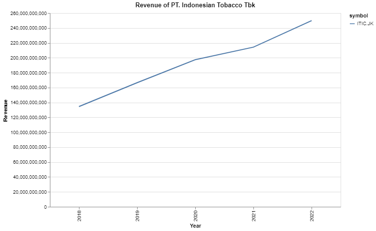
Copy
df_filtered = df[(df['symbol'] == 'ITIC.JK')]chart = alt.Chart(df_filtered).mark_line().encode( x=alt.X('year:O', title="Year"), y=alt.Y('revenue:Q', title="Revenue"), color='symbol').properties( title='Revenue of PT. Indonesian Tobacco Tbk', width=600, height=400).interactive()chart.display()
Now we can see that PT Indonesian Tobacco Tbk have a consistent increase in the revenue, this is a good insight. Now let’s take a look at the bigger picture, let’s compare all the company in Tobacco Subsector and also make it much prettier.
Copy
chart = alt.Chart(df)line = chart.mark_line(point=True).encode( x="year:O", y="revenue:Q", color = alt.Color("symbol").legend(None), tooltip = ["year", "revenue:Q"]).properties( title='Historical Revenue by Company', width=600, height=300)# Use the `argmax` aggregate to limit the dataset to the final valuelabel = chart.encode( x=alt.X('max(year):O', title="Year"), y=alt.Y('revenue:Q', title="Revenue").aggregate(argmax='year'), text='symbol')# Create a text labeltext = label.mark_text(align='left', dx=4)# Draw the chart with all the layers combinedline + text
Upon comparing the revenue of all companies, it’s evident that Gudang Garam Tbk consistently outperforms with the highest revenue. This valuable insight could significantly enhance your investment decision-making process.
To compare earnings between companies, you can easily modify the previous code by replacing revenue with earnings. We won’t repeat the code here as it remains largely the same, and we trust in your ability to make this straightforward change.We see that HM Sampoerna Tbk consistently have the highest earning compared to all companies.
The Sectors app simplifies the process of retrieving company data. We’ve demonstrated its use by visualizing and comparing company revenue and earnings. However, the Sectors Financial API offers much more. This is merely an example of its potential; there’s a wealth of data at your disposal. Feel free to explore and utilize it according to your needs.