IDX Market Overview
In this recipe, we will build a comprehensive end-to-end IDX market overview dashboard. The IDX market, also commonly referred to as IHSG, is currently among the most promising stock exchanges globally. For a further data or analysis of Indonesian Stock Market (IDX Market) you can go to Sectors App.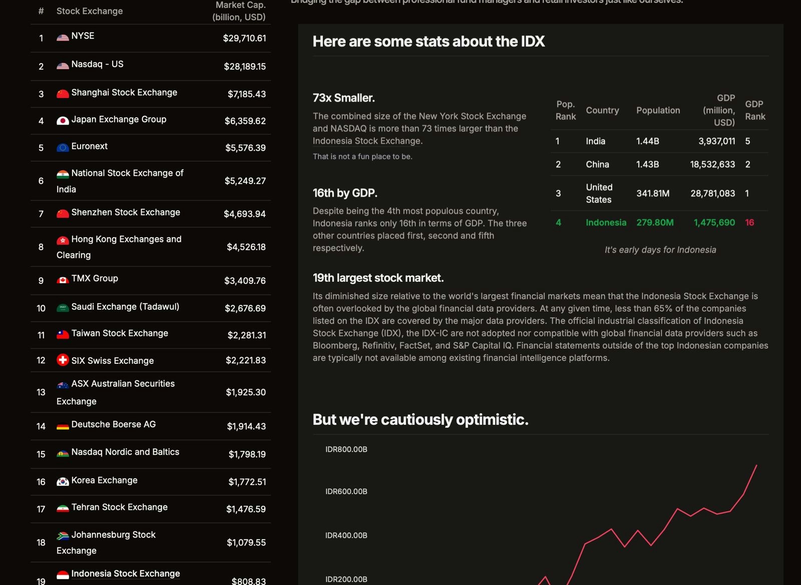
- India: Population 1.44 billion, GDP $3.9 trillion (5th largest)
- China: Population 1.43 billion, GDP $18.5 trillion (2nd largest)
- United States: Population 341.8 million, GDP $28.8 trillion (1st largest)
- Indonesia: Population 280 million, GDP $1.48 trillion (16th largest economy)
Data Fetching and Data Connector in Looker Studio
Data Fetching using Google Sheets
In this recipe, we’ll use Google Sheets to fetch data from the Sectors Financial API. Note that this is not the only way to access data from the Sectors Financial API you can also use tools like Postman or any programming language to call the API. However, to keep things as low-code as possible, we’ll be using Google Sheets in this example. Before getting started, you’ll need two tools: the API Connector extension and a Sectors Financial API key. For instructions on how to use the API Connector extension in Google Sheets, refer to this tutorial in the previous recipe. If you already familiar with the API Connector Extension, now you just need to change the all we need to do is change theRequest URL and add the headers with Authorization and value of your <API Key>.
This time we will fetch these data:
Historical IDX Market Cap
Historical IDX Market Cap
- Definition: The 30 days historical IDX Market Capitalization Value. -
URL:
https://api.sectors.app/v2/idx-total/
Historical LQ45 Index Price
Historical LQ45 Index Price
- Definition: The 30 days historical LQ45 Index Price - URL:
https://api.sectors.app/v2/index-daily/lq45/
Historical IDX30 Index Price
Historical IDX30 Index Price
- Definition: The 30 days historical IDX30 Index Price - URL:
https://api.sectors.app/v2/index-daily/idx30/
Historical JII70 Index Price
Historical JII70 Index Price
- Definition: The 30 days historical JII70 Index Price - URL:
https://api.sectors.app/v2/index-daily/jii70/
Top 10 Companies based on Market Capitalization
Top 10 Companies based on Market Capitalization
- Definition: The top 10 companies based on market capitalization
parameter in the current year - URL:
https://api.sectors.app/v2/companies/?order_by=-market_cap&limit=10
Top 10 Companies based on Revenue
Top 10 Companies based on Revenue
- Definition: The top 10 companies based on revenue parameter in 2023 -
URL:
https://api.sectors.app/v2/companies/?order_by=-revenue[2023]&limit=10
Top 10 Companies based on Earnings
Top 10 Companies based on Earnings
- Definition: The top 10 companies based on earnings parameter in the 2023
- URL:
https://api.sectors.app/v2/companies/?order_by=-earnings[2023]&limit=10
Top 10 Thirty Days Gainers
Top 10 Thirty Days Gainers
- Definition: The top 10 companies with the highest percentage change in
price in the last 30 days - URL:
https://api.sectors.app/v2/companies/top-changes/?classifications=top_gainers&n_stock=10&periods=30d
Top 10 Thirty Days Losers
Top 10 Thirty Days Losers
- Definition: The top 10 companies with the lowest percentage change in
price in the last 30 days - URL:
https://api.sectors.app/v2/companies/top-changes/?classifications=top_losers&n_stock=10&periods=30d
Data Fetching (API in Json Format) Directly into Looker Studio
After previously using Google Sheets as an intermediary to fetch data from the API before importing it into Looker Studio, we will now directly call the API in Looker Studio using the Windsor.ai connector. However, we can’t use an API with need to specify the authorization key in the url header, because it only have the box for url which make us can’t specify the header (our api-key). Disclaimer: Supertype is not affiliated with Windsor.ai and takes no responsibility for any outcomes resulting from the use of this extension.Steps to Use Windsor.ai Connector
- Open Looker Studio and create a blank report.
-
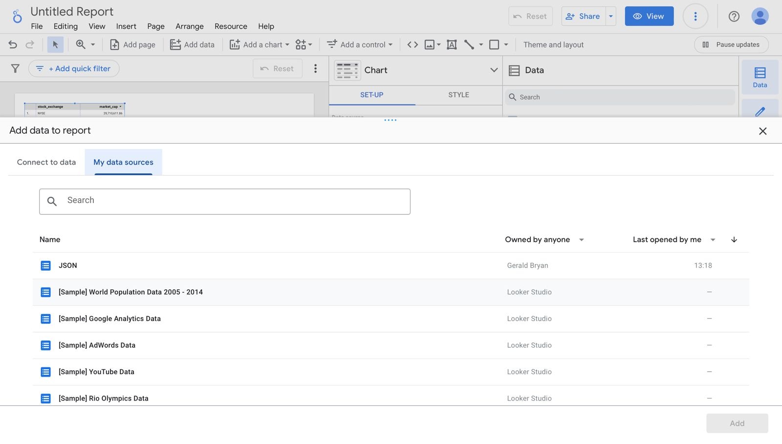
The “Add data to report” menu should automatically appear. In the search box, type
json. Under thePartner Connectorssection, select the Windsor.ai connector (highlighted in the red square).\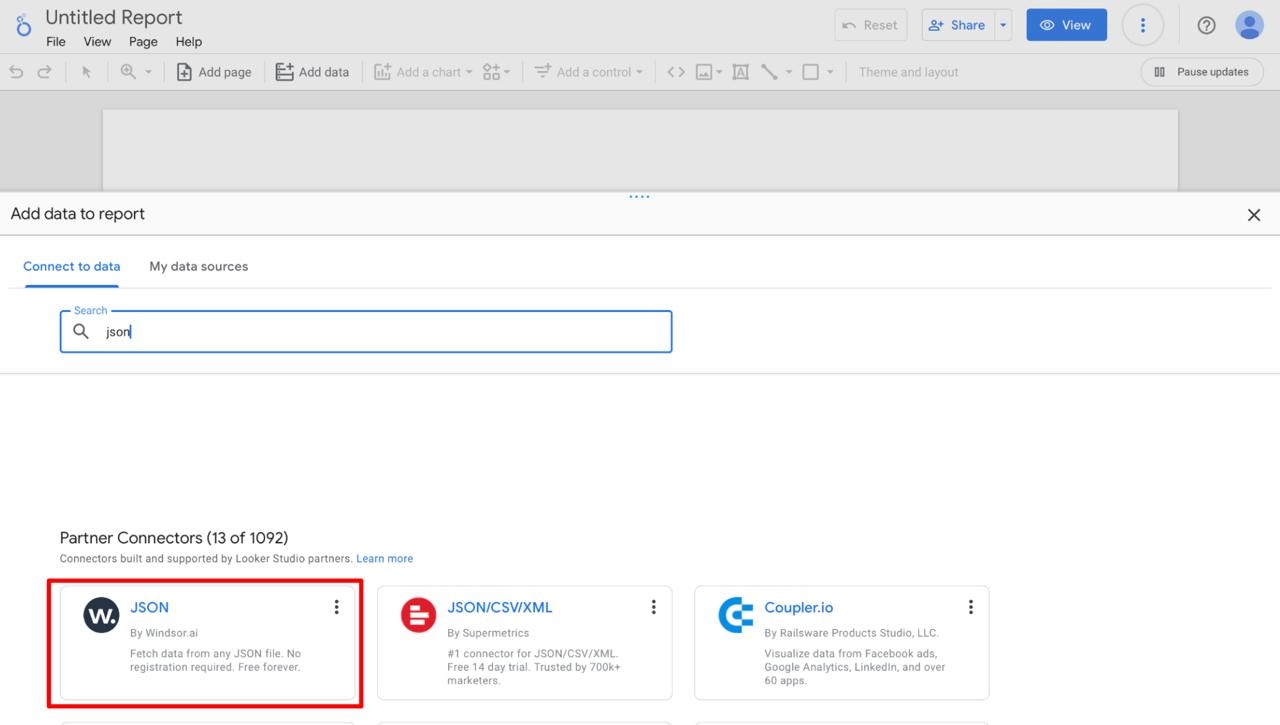
-
After selecting the connector, authorize Windsor.ai by clicking the
authorizebutton. Be sure to read the terms and conditions as well as the permissions being granted. Again, Supertype is not responsible for any consequences arising from the use of this extension.\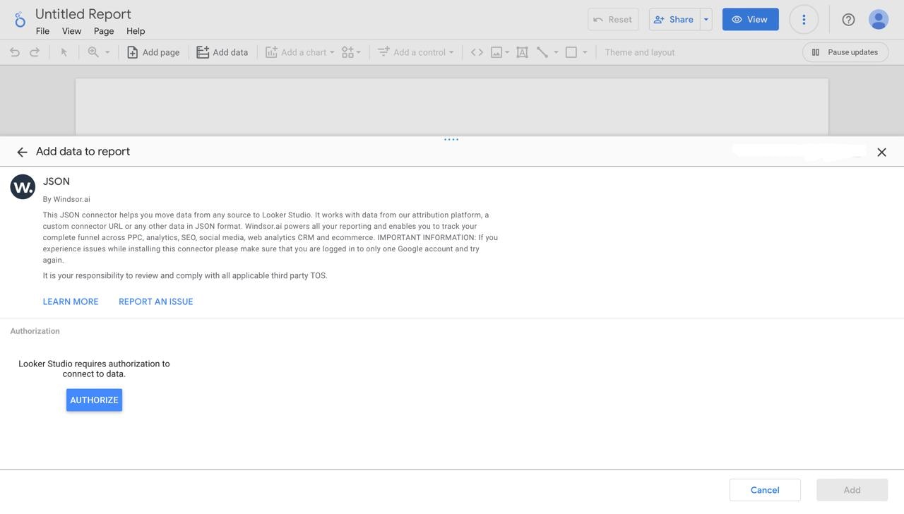
-
Once authorized, provide the URL of the JSON data source you want to use in the
Enter the URL of a JSON data sourcefield. For this article you can use this urlhttps://raw.githubusercontent.com/geraldbryan/worlwide_mcap/refs/heads/main/worldwide_mcap.json. Then, click theAddbutton.\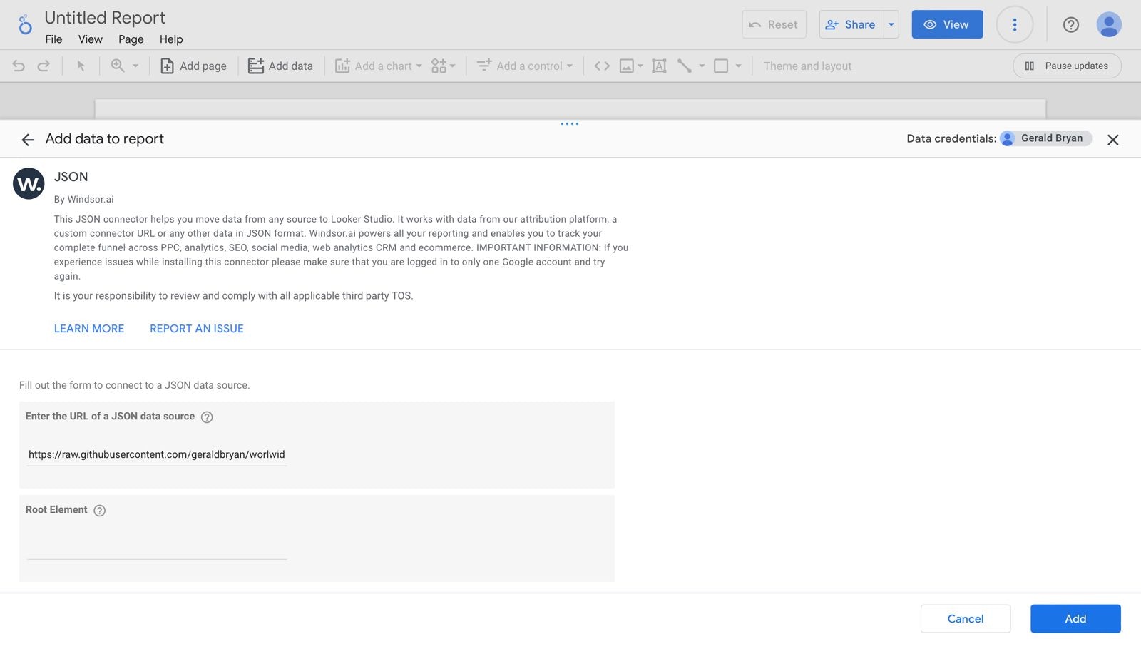
-
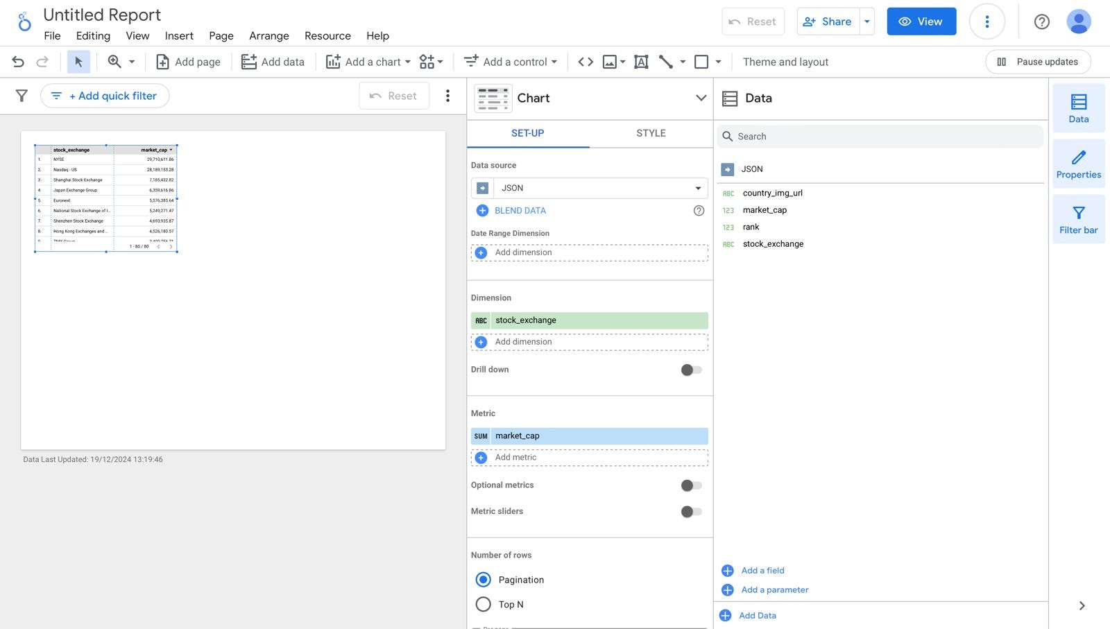
After adding the data source, you can use it in your report to create visualizations.\
-
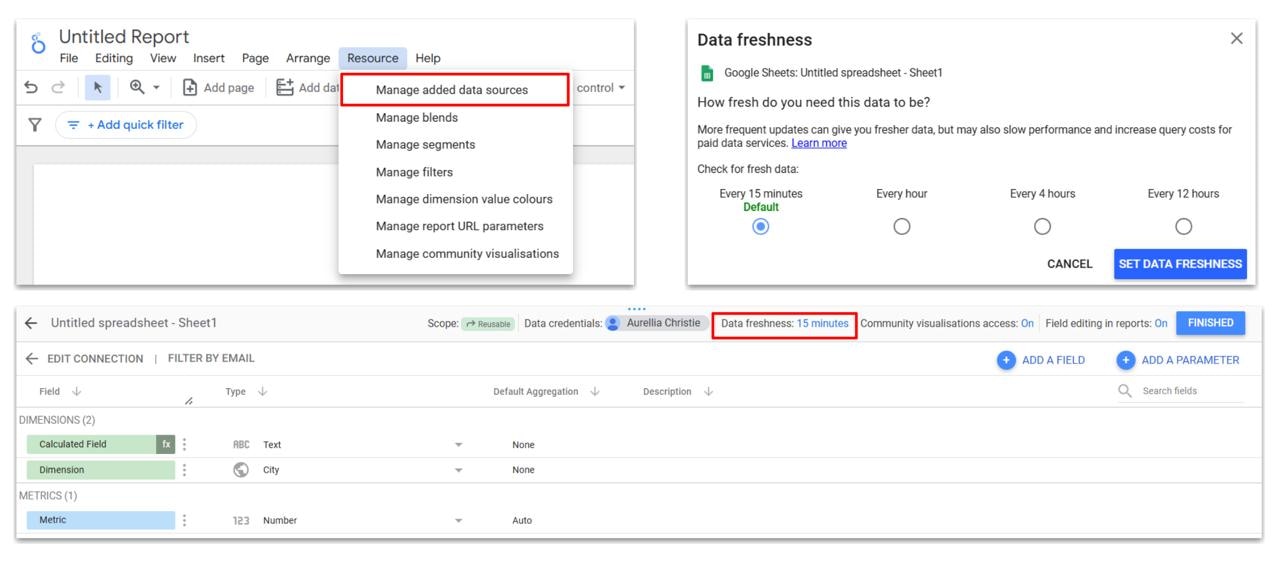
Go to the
Resourcesmenu ->Manage added data sources-> clickEditfor the dataset connected via Windsor.ai.\
-
In the settings, locate the
Community visualization accessoption, set it tooff, and clicksave.\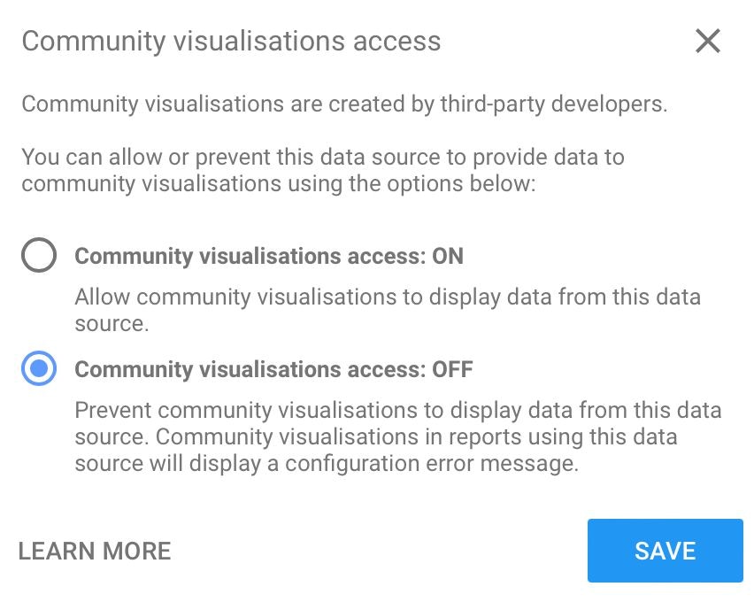
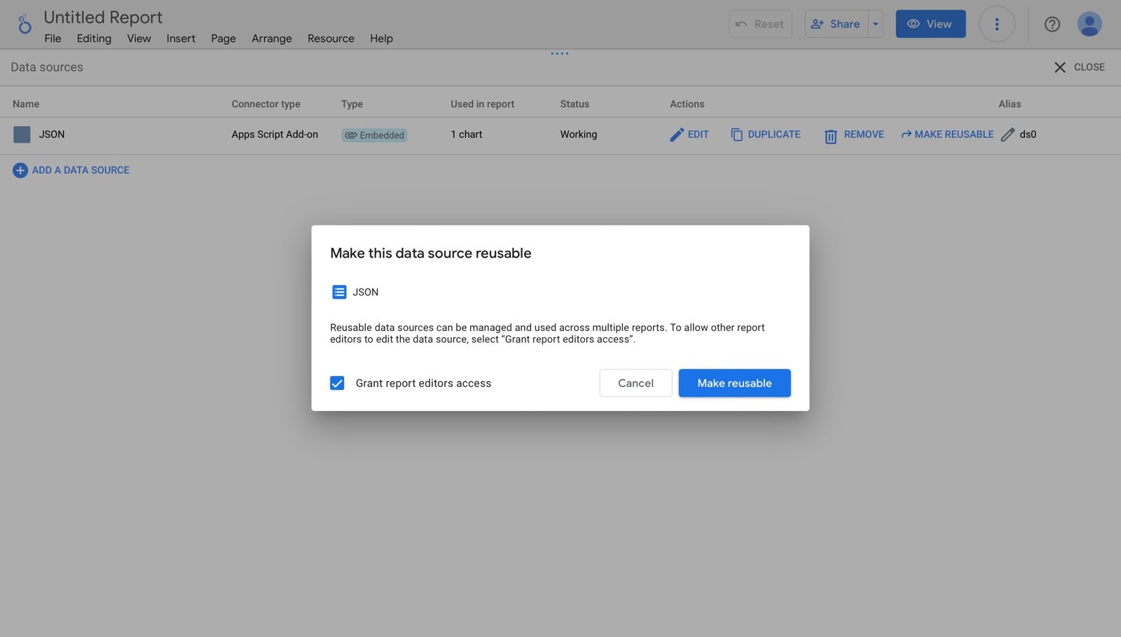
Manage Data Source in Looker Studio
Data Source Type in Looker Studio
In Looker Studio there are two type of data source, which is the data type inEmbedded scope and the other one is Reuseable Scope. The table below will explain the difference between those two type
| Embedded | Reuseable | |
|---|---|---|
| Created in a report | Can be created from homepage | |
| Can only be accessed from a single report | Can be accessed by all reports | |
| Shared / copied along with the report | Changes will be applied on all reports that used it as the data source | |
| Can be edited by anyone who can edit the report | More control over sharing | |
| Can be converted to reusable | Can not be converted to embedded |
Resource menu -> Manage added data sources, and click Make Reusable on the dataset you want to reuse.\
+Add Data menu -> switch to My data sources, and select the data you want to use.\
Data Caching (Data Freshness) in Looker Studio
One advantage of using Looker Studio to create dashboards or data visualizations is the ability to set data auto-updates, commonly referred to as data freshness in Looker. The options for data freshness vary depending on the connector being used. For more detailed information, refer to this documentation. Setting up data auto-update (data freshness) is similar to changing the data source type. Go to theResource menu -> Manage added data sources. From there, select the data source you want to auto-update, click the Data Freshness option, and modify the schedule accordingly.\
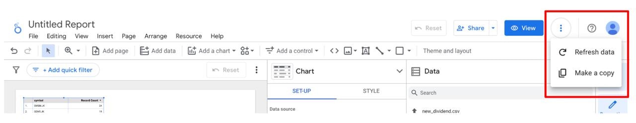
Refresh data.\
The Fundamental of Data Visualization
Before we dive into the hands-on work in Looker Studio, let’s first explore the foundational concepts of data visualization and data storytelling. In this section, I’ll cover these essential topics, laying the groundwork for Aurellia’s detailed guide on building the dashboard in Part 2.What is Data Visualization
In the big data era, the sheer volume and variety of data is actually a powerful ingredient for businesses to seek valuable insights. However, managing and interpreting the data could be incredibly complicated and time-consuming. This is where data visualization comes into play. So, what exactly is data visualization? Data visualization is the graphical representation of information and data. It converts complex datasets into visual elements like charts, graphs, maps and infographics, making it easier to interpret and understand intricate information quickly. We will be able to identify trends, outliers, patterns and correlations in the data. But before we delve deeper into the method, let’s first learn about the history of data visualization to how it has evolved to meet changing needs.Key Principles of Data Visualization
Effective data visualization involves a set of core principles that ensures that visualizations communicate insights clearly and effectively to the intended audience.Know Your Audience
Know Your Audience
- Definition: Tailoring your data visualization to the specific background, expertise and expectations of your audience. - Why It Matters: Different audiences have varying levels of familiarity with the data and its context. A well-designed visualization considers these differences. - How to Achieve It: Research and analyze your audience’s background and requirements. Customize the level of detail, complexity, and focus of your visualization to cater content that is valuable to them.
Keep Things Simple
Keep Things Simple
- Definition: Simplicity in data visualization means avoiding unnecessary complexity and focusing on presenting only the essential information. - Why It Matters: Overly complex visuals can overwhelm viewers and obscure the main points. Stripping away extraneous details and visual elements can help to maintain focus on the crucial aspects of the data. - How to Achieve It: Prioritize the most important data points and insights, using a clean design with minimalistic elements.
Use the Right Chart Type
Use the Right Chart Type
- Definition: By choosing the right chart, you ensure that the visualization helps viewers understand the data’s key features effectively. - Why It Matters: Using the right type ensures that the visualization effectively illustrates the relationships, trends, or comparisons you want to highlight, making it easier for viewers to grasp the data’s significance. - How to Achieve It: Choose a chart type that best represents the data’s characteristics, such as using bar charts for comparisons, line charts for trends, or pie charts for proportions.
Use Colors Wisely
Use Colors Wisely
- Definition: Colors can differentiate data series, highlight important data points, and improve the overall visual appeal. - Why It Matters: The strategic use of colors enhances readability and emphasizes key information, drawing attention to critical insights. - How to Achieve It: Select a color palette that provides clear contrast and supports the visualization’s goals. Be mindful of color blindness and ensure that the color scheme is accessible to all viewers.
Highlight the Most Important Information
Highlight the Most Important Information
- Definition: Emphasizing the most critical data points and insights in a visualization for the audience to grasp the essential insights and take actionable steps based on the information presented. - Why It Matters: Directs the audience focus to the core message, facilitating quicker comprehension and more effective decision-making. - How to Achieve It: Use visual techniques such as size, color, or positioning to make key data points stand out.
Avoid Clutter
Avoid Clutter
- Definition: Avoiding clutter means keeping the design of the visualization clean and focused. - Why It Matters: Maintaining a clean design enhances the effectiveness of the visualization. Prevent being overwhelmed by extraneous details. - How to Achieve It: Remove non-essential elements, simplify data presentation, and use whitespace effectively to create a visually appealing and focused design.
Avoiding Data Visualization Common Pitfalls
When creating visualizations, it’s important to avoid common pitfalls to ensure your data is accurately represented and easily interpreted.Misleading Visuals
- Scale Issues: Manipulating the scale of axes can distort the data. For instance, truncating the y-axis in a bar chart can exaggerate differences between bars.
- Always use a consistent scale or start the axis at zero to avoid misleading viewers.
- Inappropriate Chart Types: Using a pie chart for data with too many categories can be confusing. Pie charts work best with a small number of categories.
- For more categories, consider a bar chart instead.
- Cherry-Picking Data: Selecting only a subset of data to support a specific narrative can be misleading.
- Ensure your visualization represents the full dataset to provide an accurate picture.
Overcomplicating with Too Much Data
- Cluttered Visuals: Including too many data series or categories in a single chart can make it hard to interpret. Keep your visualizations focused and use additional charts if necessary to break down complex data.
- Excessive Details: Adding too many details (e.g., excessive grid lines or labels) can overwhelm the viewer. Use clean, simple designs and only include essential information to ensure clarity.
- Complexity Over Clarity: Sometimes, a simple chart (like a basic bar or line chart) can be more effective than a complex visualization (like a 3D chart or interactive dashboard). Prioritize clarity over complexity to ensure your audience can easily understand the data.
Data Storytelling
Traditional education often treats creative storytelling and technical analysis as separate skills, but today’s job market values professionals who excel in both. However, data visualization is a prime example of where these two areas intersect, making it a highly sought-after skill in our data-driven world. Data storytelling involves merging solid data with compelling narratives to present insights in a way that resonates with audiences. This approach relies on three essential components: data, narrative, and visuals.- Data: The raw numbers and facts that provide the foundation of the story.
- Narrative: The context and interpretation that give meaning to the data.
- Visuals: The charts, graphs, and other visual aids that illustrate the data and narrative.
1. Crafting a Data Story
Understanding your Audiences
Understanding your Audiences
Different audience segments might require distinct approaches: executives might prefer high-level insights with clear business implications, while technical teams may appreciate detailed data and methodology.
By customizing your story to align with these diverse expectations, you ensure that each segment receives the most relevant and impactful information, ultimately leading to better engagement and more informed decision-making.
Defining the Purpose
Defining the Purpose
By focusing on a central theme or insight, you ensure that your story remains coherent and impactful.
Whether your aim is to highlight performance metrics, uncover new opportunities, or address specific challenges, ensuring that your narrative supports the broader objectives of your organization helps in securing buy-in from stakeholders and reinforcing the strategic value of your insights.
Identifying Key Insights
Identifying Key Insights
A critical step in crafting a compelling data story is data analysis and insight extraction.
The goal is to interpret the data in a way that highlights the most relevant and actionable insights, making it easier for your audience to understand the implications and take informed actions based on your findings.
2. Building the Narrative
Setting the Context
Setting the Context
This involves providing background information and context for the data, helping your audience grasp why the data matters and how it fits into the larger picture.
Highlighting Key Insights
Highlighting Key Insights
This means pinpointing the data points that have the greatest significance and potential impact, and then using narrative elements such as anecdotes, analogies, or visual highlights to draw attention to these insights.
Creating a Flow
Creating a Flow
This involves structuring your narrative with clear transitions and logical sequencing, making it easy for the audience to follow along.
3. Delivering the Stories
Presentation Techniques
Presentation Techniques
Presentation techniques play a crucial role in effectively delivering your data story.
Best practices for presenting data stories include clear articulation of key points, maintaining a logical structure, and using visuals to enhance understanding.
Engaging the audience involves not just presenting the data, but also connecting with them through confident delivery, interactive elements, and storytelling techniques that keep their interest.
Effective delivery ensures that your audience remains attentive, understands the insights, and is motivated to take action based on your findings.