The tools: ggplot2 and httr
ggplot2 is a fantastic package for creating visualizations in R, following the Grammar of Graphics philosophy by Leland Wilkinson (where the double ‘g’ in ‘ggplot’ comes from).
You should be familiar with the basics of R to make the most out of this series, but prior experience with ggplot2 isn’t expected. Like R, packages such as ggplot2 and httr are open-source and free to use.
We’ll also use httr to make HTTP requests to the Sectors Financial API. Acting as a wrapper around the curl package, it exposes a simple and consistent set of http verbs like GET, POST, PUT, and DELETE to interact with modern web APIs.
Checklist
To make the most out of this recipe, ensure you have met the following requirements:- R installed on your machine
- RStudio (recommended) or an IDE of your choice
ggplot2,httr, andjsonlitepackages installed- In R, installing a package is as simple as running
install.packages("package_name"), e.g.,install.packages("ggplot2")
- In R, installing a package is as simple as running
- Valid API keys from Sectors Financial API, which you can acquire from your Sectors App account
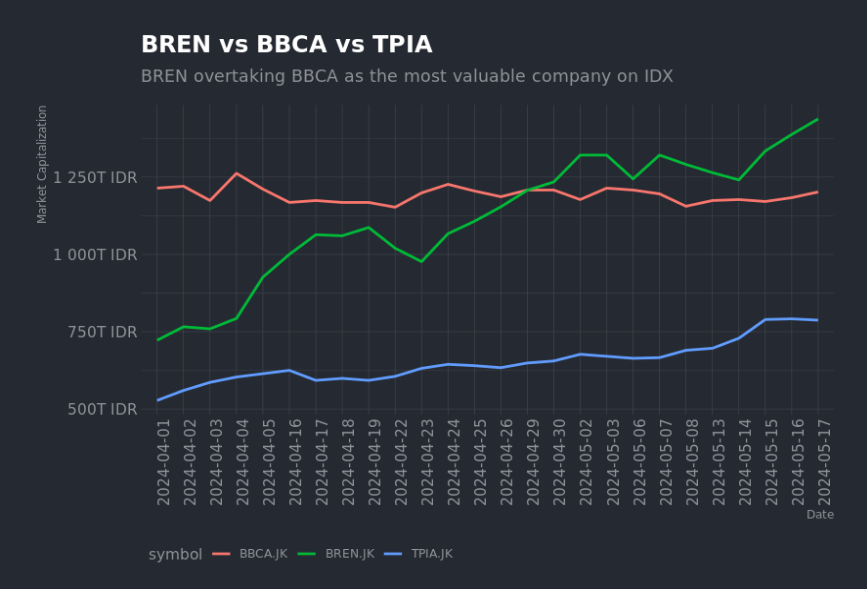
Background: Barito Renewables (BREN) makes history
We’ll be visualizing the stock price of Barito Renewables (BREN) and Bank Central Asia (BBCA) from the Indonesia Stock Exchange (IDX). BREN is a renewable energy company that has seen a meteoric rise in the past year, while BBCA is consistently the largest company in Indonesia by market capitalization. Barito Renewables (BREN) significant rise is noteworthy for many reasons:- It is now a $90 billion USD company (BBCA is ~$75 billion USD), and together, BREN and BBCA make up more than 20% of the entire IDX market capitalization
- As it overtakes BBCA in market capitalization, it is now the largest company in Indonesia and the first company to topple BBCA since 2017. In other words, the last time BBCA wasn’t the most valuable company was 7 years ago — it has never lost its number 1 spot since then, pointing to the banking giant’s dominance and longevity in the Indonesian financial market
- BREN opened at IDR975 on its first day of trading on IDX (2023-10-09), but has since recorded an astounding 1002.56% increase to IDR10,750 as of 2024-05-17. This is a remarkable feat for a company that has only been listed for less than a year
- Barito Renewables is now worth more than the 5 largest Malaysian companies combined (Maybank, Public Bank, CIMB, Tenaga Nasional, Petronas), collectively 22% of the Malaysian stock market
- Sectors have a comprehensive stock report on BREN and BBCA, which you can access here:
From Sectors Financial API to R’s data frame
In R, you typically load the libraries you need at the beginning of your script. Here, we’ll loadhttr and jsonlite to make HTTP requests and parse JSON responses, respectively, along with ggplot2 for data visualization.
BBCA as an example):
BBCA with BREN to get the stock price data for Barito Renewables. The start and end parameters specify the date range for the data you want to retrieve. Your header should include the Authorization key with your API key as the value.
response object contains the data you requested. You can extract the JSON content from the response using content(response, "text") and parse it into a data frame using fromJSON() from the jsonlite package. A 200 status code indicates a successful request.
To iterate through the stocks you want to retrieve, you can use a loop or a function. Here’s how our code might look like if we were to retrieve the stock price data for both BREN and BBCA. For the purpose of this recipe, I’ve added Chandra Asri (trading under the symbol TPIA), third-largest company on IDX after BREN and BBCA.
df_daily data frame should now contain the stock price data for BREN, BBCA and TPIA. You can use tail(df_daily) to view the last few rows of the data frame:
Visualizing stock prices of BREN vs BBCA
Now that we have the stock price data for BREN and BBCA, we can useggplot2 to create a line plot that visualizes the stock prices over time. We’ll plot the closing price of BREN and BBCA on the same graph to compare their performance over the selected date range.
To assist in the y-axis scaling, I’ve also loaded the scales package to help rescale the market capitalization values.
ggplot() function initializes the plot, and the aes() function specifies the aesthetics of the plot, including the x-axis (date), y-axis (market_cap), grouping (symbol), and color (symbol).
The geom_line() function creates a line plot, and the labs() function sets the labels for the x-axis, y-axis, title, and subtitle. Setting linewidth to 1 gives the line the right thickness for better visibility.
The scale_y_continuous() function rescales the y-axis labels using the label_number() function from the scales package.
The final layer of the plot is the theme() function, which customizes the appearance of the plot. Here, we rotate the x-axis labels by 90 degrees, position the legend at the bottom, and justify the legend to the left.
You should have a line plot that looks like the one below: