Getting familiar with Streamlit
Why do we choose Streamlit to build SectorScan? Because it has these key features:- Simple: Streamlit’s intuitive API allows you to create powerful web apps with minimal effort.
- Fast: Quickly iterate on your app and see changes in real-time with Streamlit’s automatic hot reloading.
- Flexible: Streamlit supports a wide range of data visualization libraries, making it easy to incorporate charts, tables, and other visualizations into your app.
- Sharing: Share your apps with others by deploying them to Streamlit’s cloud platform or hosting them on your own server.
-
Let’s create a folder called
sectorscanin your chosen working directory and create a file calledsectorscan.pyinside it. -
Please make sure you’ve already installed
streamlitin your local. If you’ve done that, now import it to your Python script (sectorscan.py) using this code: -
Using this documentation as your reference, write your app using Streamlit’s simple API:
-
Run your app from the command line:
-
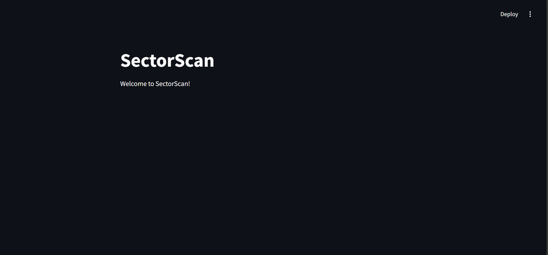
That’s it! You’ve created your first Streamlit app. The previous command line you run should redirect you to the browser showing your app as follows:
CTRL + Cin your command line.
Build the SectorScan
To make your life easier, keep this documentation open while you follow along with this tutorial. Feel free to also modify my code if you find a better way to display the app’s contents!Data retrieval function
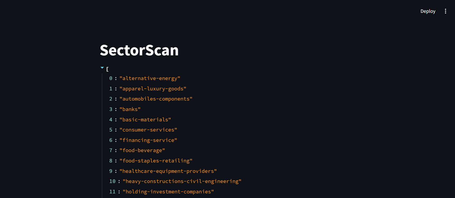
First thing that we want to move to our app is the function to retrieve Sectors data. But certainly, there are some modifications we need to do. One thing we need to modify is the way we call the API key. There’s no way we’re going to display the API key right away in our code for our safety. Thus, we’re going to utilize streamlit secrets in our function:-
Create a folder called
.streamlitin yoursectorscanfolder, and fill it with a file namedsecrets.toml. -
In the TOML file, create a new variable called
SECTORS_KEYand paste your API key there: -
Access the secrets from your Python script using
st.secrets:
raise Exception. Since we’re creating an app, we need to let the user knows if something went wrong, but in the same time, not being too specific. Thus, we’ll use st.error() to notice the user about the error:
st.cache_data decorator to our function to make use of cache on our function calls. Cache is a mechanism for temporarily storing frequently accessed data to improve performance and reduce redundant computations.
So the final function looks like this:
st.write():
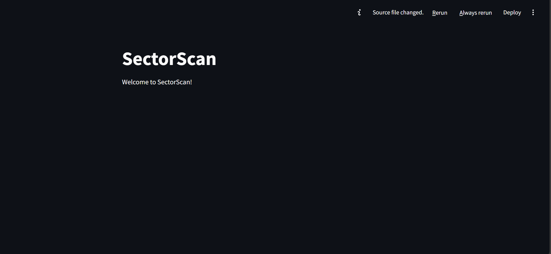
Always rerun button on the top right of the page. But if you only want to reload the app when you ask the app to do so, click the Rerun button instead. If the function works, your app should look like this after you click the button (I’ve removed the welcome text to make the app tidier):
st.write() and let’s continue to bring more content to our app!
Sectors filter component
Since we want to compare data from different sectors in this app, we want to make sure that we provide a component for the user to choose which sectors they want to compare. Thus, we’re going to provide a multiselect filter that displays all the available sectors. We’ll usest.multiselect() for this:
options variable to contain the selected sectors to be used across our code later. And to ensure the visualizations remain clear and easy to read, we limit the maximum selections to 5 sectors. When your app reloads, it should show the multiselect filter as follows:
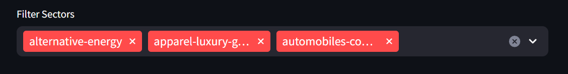
..-.. format, so we’ll utilize format_func parameter of the st.multiselect() to display the options in a prettier way:
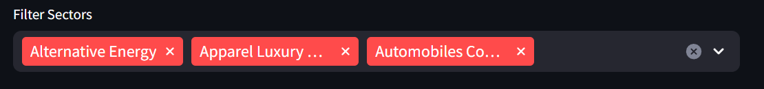
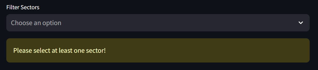
st.multiselect(), there’s no option to disable the clear options button, thus, we have to make sure that we handle the case when user clears the options (no sector is selected). We’ll use st.warning() to warn the user about this:
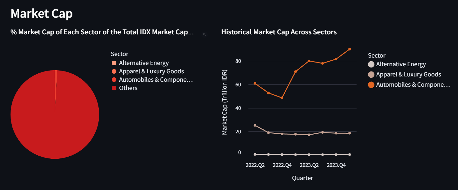
Market cap section
In the market cap section, we’re going to display two rows:- The first row will be divided into two columns to display the total market cap and historical market cap visualization
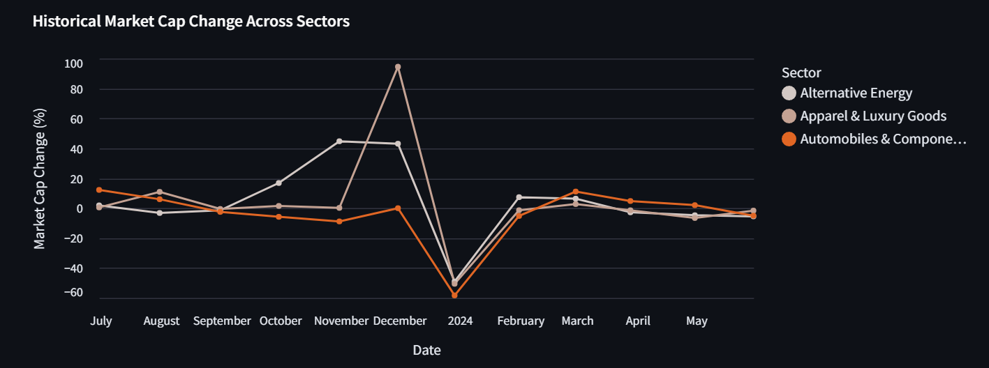
- The second row will show the historical market cap change visualization.
sectorscan.py. Copy paste the last chunk of code of this section.
Since now we’re retrieving the data based on the selected sectors, we need to modify the code a bit. Instead of using range(3), we’ll change it to our options variable:
First row of the market cap section
To process the first row, don’t forget to also move the following codes tosectorscan.py:
- Code to produce the final data frame of
df_mc_currand themc_curr_chartcode in this section - Code to produce the final data frame of
df_mc_histand themc_hist_chartcode in this section.
st.columns(). And to display the altair charts, we’ll use st.altair_chart():
Second row of the market cap section
For the second row, let’s first move the code to produce the final data frame ofdf_mc_change and the code of mc_change_chart from this section to sectorscan.py.
Since the second row is not divided into columns, we can directly use st.altair_chart() to display the chart:
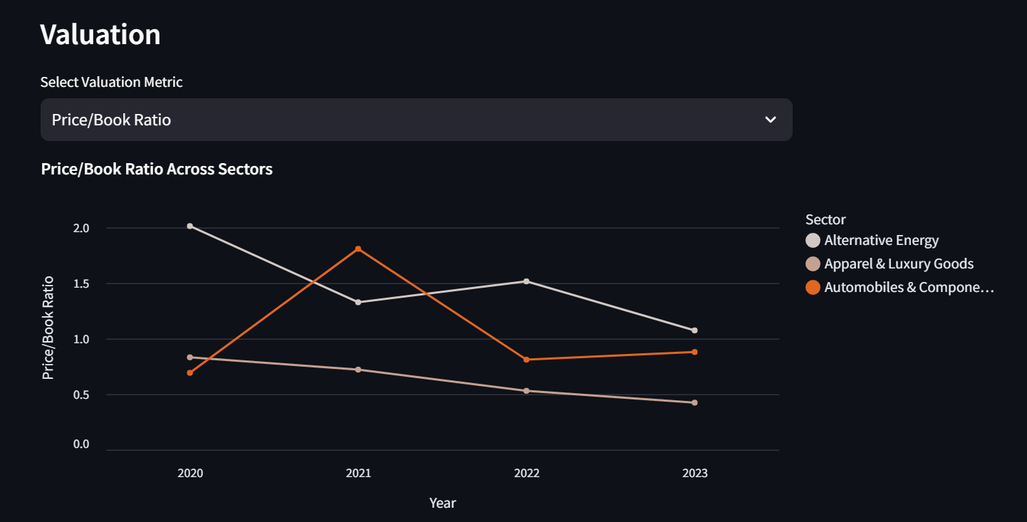
Valuation section
First let’s move the code to retrieve valuation data from the last chunk of code of this section. Don’t forget to change therange(3) to options:
st.selectbox() to do so:
option variable will contain the selected valuation metric and we’ll use it to make our valuation_chart to be dynamic. Move the valuation_chart code from this section to sectorscan.py, but change all the Price/Book Ratio to option. Then, display it using st.altair_chart():
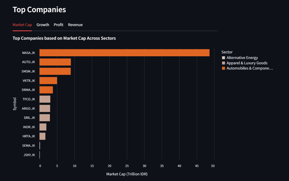
Top companies section
In this section, we’ll use tabs to display the visualizations. There are four tabs we want to create here:Market Capto display Top companies based on Market CapGrowthto display Top companies based on Revenue GrowthProfitto display Top companies based on ProfitRevenueto display Top companies based on Revenue
sectorscan.py. Also change the range(3) to options:
sectorscan.py:
- Code to produce the final data frame of
df_top_mcand themc_chartcode in this section - Code to produce the final data frame of
df_top_growthand thegrowth_chartcode in this section - Code to produce the final data frame of
df_top_profitand theprofit_chartcode in this section - Code to produce the final data frame of
df_top_revenueand therevenue_chartcode in this section.
st.tabs():
(Optional) Deploy the SectorScan
Actually if you only need your app locally, you can stop right here. But if you want your app to be accessible anywhere, you need to continue to this section.Prerequisite
Some additional prerequisites are required to be able to deploy the app:Step by step
We’re going to follow this documentation to deploy our app:-
Login and go to Github, then click the
Newbutton: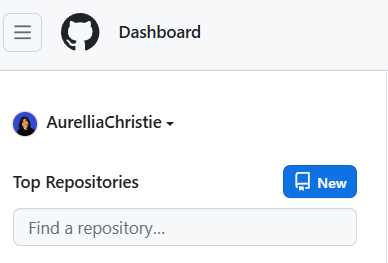
-
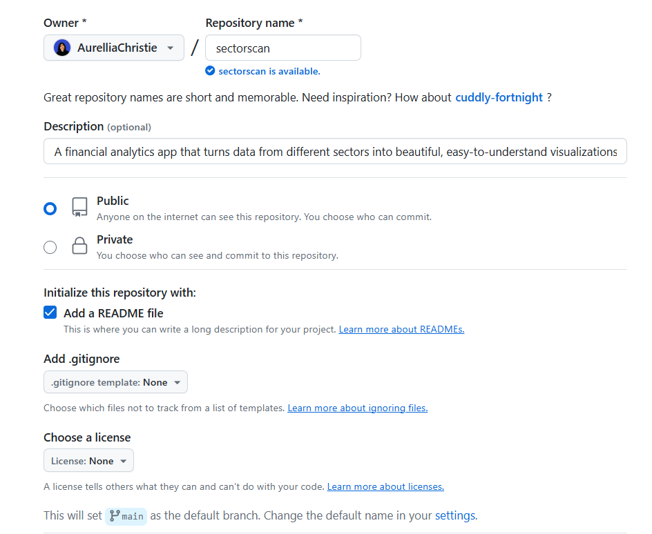
Fill in the repository details, more or less as follows:
-
Click the
Create repositorybutton. -
Now, prepare your files:
-
sectorscan.pythat we’ve created throughout this recipe. -
requirements.txtwith the content as follows:
-
-
Upload both of the files to the repository by clicking the
Add file-Upload filesbutton on the repository page: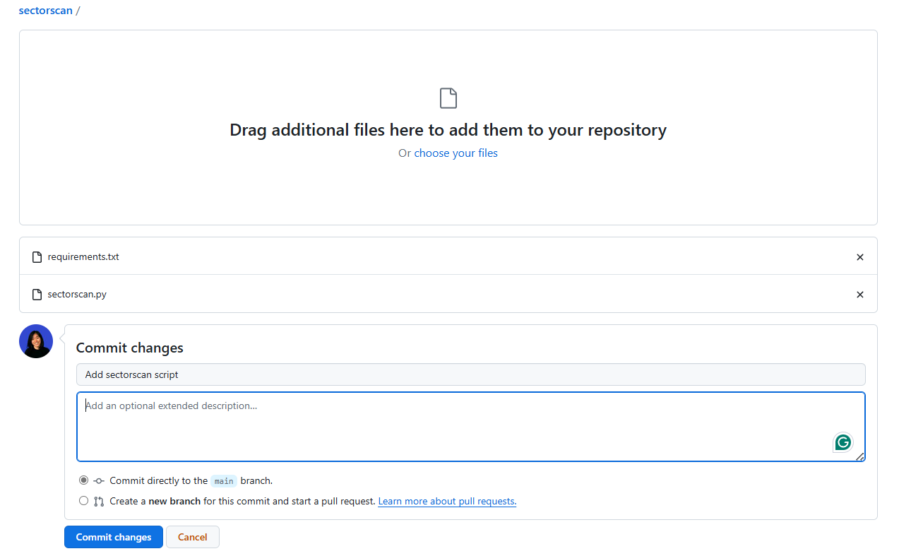
Commit changesbutton. Your repository is ready to be deployed! Your repository page now should look like this: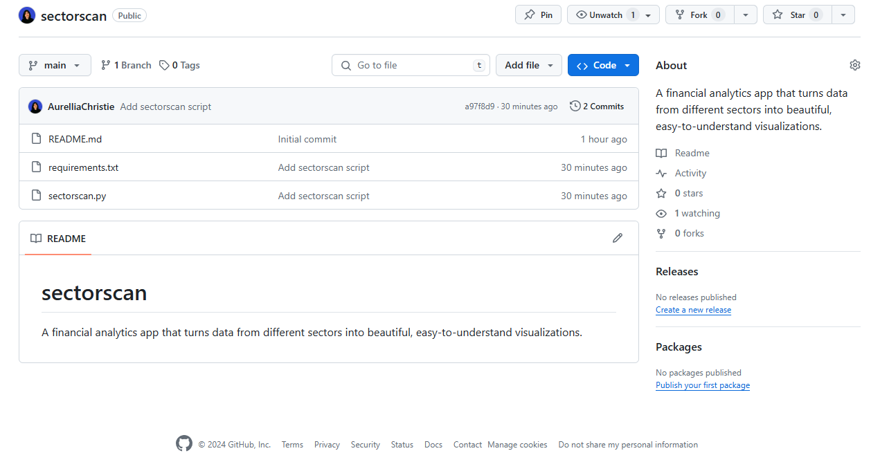
- Login to Streamlit to deploy the app.
-
Click the
Create appbutton on the top right: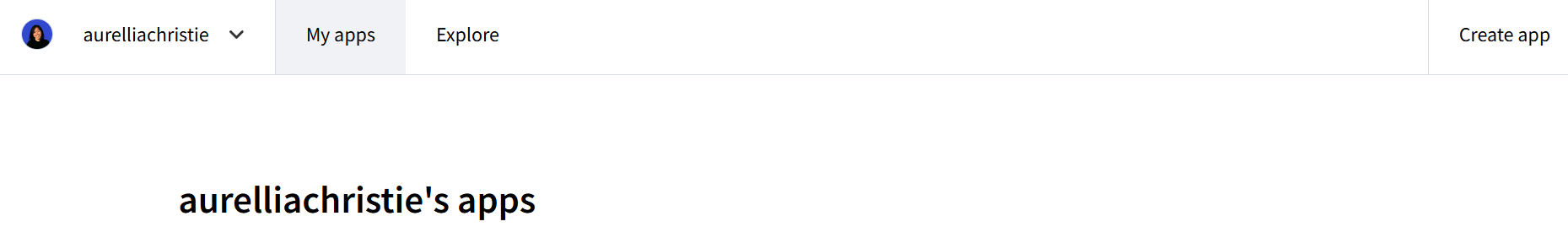
-
Click on the
Yup, I have an appoption. -
Fill in the app detail as follows:
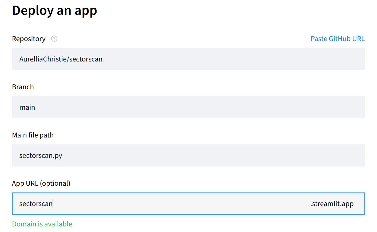
sectorscan.streamlit.app. -
Click the
Advance settings...link below theApp URLand paste the content ofsecrets.tomlin there: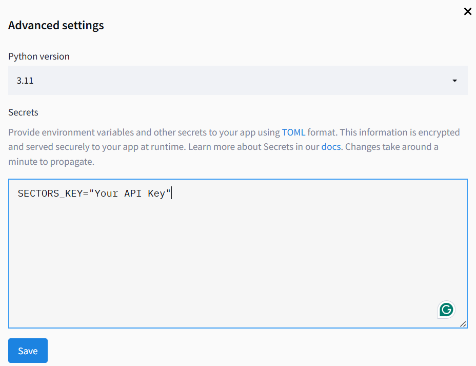
Savebutton. -
Last step, click the
Deploy!button and congrats, your app is ready!