We will build a financial analytics app, called SectorScan, that turns data from different sectors into beautiful, easy-to-understand visualizations. User can choose which sectors to compare, and the app will analyze the Market Cap, Valuation, and Top Companies in those sectors. By comparing various sectors, user can quickly spot which ones are performing better than the others. It’s like having a bird’s eye view of the market, making it easier to see trends and patterns that might not be obvious otherwise. This app is great for investors who want to track the market without getting lost in the details.
The entire app will be built using streamlit
, an open-source Python app framework that’s incredibly easy to use and perfect for beginners. With streamlit
, you can create beautiful, interactive web applications with just a few lines of Python code. It’s designed to let you focus on your data and insights without needing extensive web development experience, making it ideal for data scientists, analysts, and developers.
For the visualizations, we’ll use altair
, a powerful and user-friendly Python library. altair
works seamlessly with streamlit
, allowing you to create stunning, interactive charts and graphs. Even if you’re new to Python, the simplicity of streamlit
combined with the intuitive design of altair
will help you get started quickly. Rest assured, you’ll get along just fine with this recipe!
Note: If you want to first get familiar with altair
, you can self-enroll in the Data Visualization with Altair course offered by Supertype Fellowship.
Prerequisite
To follow this recipe, you need the following prerequisites:
-
Python installed on your machine
-
Visual Studio Code or an IDE of your choice
-
Valid API keys from Sectors API, which you can acquire from your Sectors App account
-
The pip management tool
-
streamlit v.1.35.0
package installed, by running the following code:
pip install streamlit==1.35.0
By installing this package, all the necessary dependencies, including pandas
, requests
, and altair
, will also be installed.
Dive into the data
In this section, we’ll dive into exploring and visualizing data from the Sectors API, setting the foundation for our app. Feel free to use Google Colab or create a .ipynb
notebook in your IDE to follow along and experiment with the data. We’ll start by getting familiar with the data and creating some insightful visualizations.
Alright, first things first. Please make sure you already have your API key from your Sectors App. And since we’ll be calling some endpoints from the Sectors API, let’s create a simple function to handle this. This will make our next steps much easier:
def fetch_data(url):
api_key = "Your API Key"
headers = {
"Authorization": api_key
}
response = requests.get(url, headers = headers)
if response.status_code == 200:
return response.json()
else:
raise Exception(f"API request failed with status code {response.status_code}")
List of All Sectors
Before we can compare data from different sectors, we need to get a list of all available sectors. This can be achieved by using the following endpoint from the Sectors API:
GET https://api.sectors.app/v1/subsectors/
So, we just need to call the URL using our function and save the data into a new variable called sectors
.
url = "https://api.sectors.app/v1/subsectors/"
data = fetch_data(url)
If you try to access the variable, it should look like the followings:
[
{
"sector": "financials"
"subsector": "financing-service"
},
{
"sector": "financials",
"subsector": "insurance"
},
{
"sector": "consumer-cyclicals",
"subsector": "retailing"
}
...
]
Since we only need the subsector
data to filter our data later on, we’ll create a list contains of the subsector data only:
sectors = [item['subsector'] for item in data]
The result should look like the following:
[
'financing-service',
'insurance',
'retailing',
...
]
Market cap
As I mentioned before, there are three things that we want to compare in SectorScan, and the first thing is Market Cap.
Market cap data processing
We can utilize the following endpoint to get the market cap data from each sector:
GET https://api.sectors.app/v1/subsector/report/{sector}/?sections=market_cap
And once we call it using our function,
url = f"https://api.sectors.app/v1/subsector/report/{sectors[0]}/?sections=market_cap"
market_cap = fetch_data(url)
the result should look like this:
{
'sector': 'Financials',
'sub_sector': 'Financing Service',
'market_cap': {
'total_market_cap': 46765349582848.0,
'avg_market_cap': 3117689972189.8667,
'quarterly_market_cap': {
'prev_ttm_mcap': {
'2022.Q2': 39870000000000,
...
},
'current_ttm_mcap': {
'2023.Q2': 53724000000000,
...
},
'current_ttm_mcap_pavg': {
'2023.Q2': 293918156250000.0,
...
}
},
'mcap_summary': {
'mcap_change': {
'1w': 0.011991989685872173,
'1y': 0.009876254272436729,
'ytd': -0.05965073445094042
},
'monthly_performance': {
'2023-06-30': 0.1601451153148484,
...
},
'performance_quantile': 0.515151515151515
}
}
}
We will transform total_market_cap
, quarterly_market_cap
, and monthly_performance
into three pandas
data frames:
-
mc_curr
to store the total market cap:
mc_curr = pd.DataFrame({
"Sector": market_cap["sub_sector"],
"Total Market Cap": market_cap["market_cap"]["total_market_cap"]
}, index=[0])
The result:
| Sector | Total Market Cap |
---|
0 | Financing Service | 4.676535e+13 |
-
mc_hist
to store the quarterly market cap:
First let’s test how the data frame would look like if we try to create one from quarterly_market_cap
:
test = pd.DataFrame(market_cap["market_cap"]["quarterly_market_cap"]["prev_ttm_mcap"], index=["quarter"])
The result:
| 2022.Q2 | 2022.Q3 | 2022.Q4 | 2023.Q1 |
---|
quarter | 39870000000000 | 41848000000000 | 43047000000000 | 49290000000000 |
To make it easier to be visualized, we will change the data format from wide
to long
using pd.melt()
function, then add the Sector
column:
df = pd.melt(pd.DataFrame(market_cap["market_cap"]["quarterly_market_cap"]["prev_ttm_mcap"], index=["quarter"]), var_name="Quarter", value_name="Market Cap")
df["Sector"]= market_cap["sub_sector"]
df = df[["Sector", "Quarter", "Market Cap"]]
The result:
| Sector | Quarter | Market Cap |
---|
0 | Financing Service | 2022.Q2 | 39870000000000 |
1 | Financing Service | 2022.Q3 | 41848000000000 |
2 | Financing Service | 2022.Q4 | 43047000000000 |
3 | Financing Service | 2023.Q1 | 49290000000000 |
Since there are two keys in quarterly_market_cap
that we want to use: prev_ttm_mcap
and current_ttm_mcap
, we can use looping to create the final mc_hist
:
mc_hist = pd.DataFrame()
for i in ["prev_ttm_mcap", "current_ttm_mcap"]:
df = pd.melt(pd.DataFrame(market_cap["market_cap"]["quarterly_market_cap"][i], index=["quarter"]), var_name="Quarter", value_name="Market Cap")
df["Sector"]= market_cap["sub_sector"]
df = df[["Sector", "Quarter", "Market Cap"]]
mc_hist = pd.concat([mc_hist, df], ignore_index=True)
pd.concat()
there is working to combine the data frame of prev_ttm_mcap
and current_ttm_mcap
into one data frame.
-
mc_change
to store the monthly performance
Similar as mc_hist
, we will use pd.melt()
to create an easier-to-be-visualized data frame:
mc_change = pd.melt(pd.DataFrame(market_cap["market_cap"]["mcap_summary"]["monthly_performance"], index=["date"]), var_name="Date", value_name="Market Cap Change")
mc_change["Sector"] = market_cap["sub_sector"]
mc_change = mc_change[["Sector", "Date", "Market Cap Change"]]
The result:
| Sector | Date | Market Cap Change |
---|
0 | Financing Service | 2023-06-30 | 1.601451e-01 |
1 | Financing Service | 2023-07-31 | -7.817735e-04 |
2 | Financing Service | 2023-08-31 | -7.589136e-02 |
… | … | … | … |
Now since we want to compare data of more than one sector, let’s do a looping to combine the above data of the first three sectors in our list:
df_mc_curr = pd.DataFrame()
df_mc_hist = pd.DataFrame()
df_mc_change = pd.DataFrame()
for i in range(3):
url = f"https://api.sectors.app/v1/subsector/report/{sectors[i]}/?sections=market_cap"
market_cap = fetch_data(url)
mc_curr = pd.DataFrame({
"Sector": market_cap["sub_sector"],
"Total Market Cap": market_cap["market_cap"]["total_market_cap"]
}, index=[0])
df_mc_curr = pd.concat([df_mc_curr, mc_curr], ignore_index=True)
mc_hist = pd.DataFrame()
for i in ["prev_ttm_mcap", "current_ttm_mcap"]:
df = pd.melt(pd.DataFrame(market_cap["market_cap"]["quarterly_market_cap"][i], index=["quarter"]), var_name="Quarter", value_name="Market Cap")
df["Sector"] = market_cap["sub_sector"]
df = df[["Sector", "Quarter", "Market Cap"]]
mc_hist = pd.concat([mc_hist, df], ignore_index=True)
df_mc_hist = pd.concat([df_mc_hist, mc_hist], ignore_index=True)
mc_change = pd.melt(pd.DataFrame(market_cap["market_cap"]["mcap_summary"]["monthly_performance"], index=["date"]), var_name="Date", value_name="Market Cap Change")
mc_change["Sector"] = market_cap["sub_sector"]
mc_change = mc_change[["Sector", "Date", "Market Cap Change"]]
df_mc_change = pd.concat([df_mc_change, mc_change], ignore_index=True)
Total market cap visualization
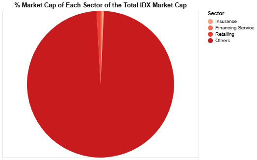
In this first visualization, we want to compare the total market cap of each sector. But to make the visualization more robust, we will compare the percentage market cap of each sector from the total IDX market cap. Thus, we will need to first combine our df_mc_curr
with the IDX market cap data that we can obtain using the following endpoint:
GET https://api.sectors.app/v1/idx-total/
Call it using our function,
today = datetime.today()
yesterday = today - timedelta(days=1)
formatted_yesterday = yesterday.strftime('%Y-%m-%d')
url = f"https://api.sectors.app/v1/idx-total/?start={formatted_yesterday}"
idx = fetch_data(url)
The result looks like the following:
[
{
"date": "yesterday_date",
"idx_total_market_cap": 11741696124656268
},
{
"date": "today_date",
"idx_total_market_cap": 11682715125038308
}
]
What we need is only today’s market cap data, so let’s save it to new variable called idx_mc
:
idx_mc = idx[-1]["idx_total_market_cap"]
Now let’s modify df_mc_curr
to meet our needs for the visualization:
df_idx_mc = pd.DataFrame({
"Sector": "Others",
"Total Market Cap": idx_mc - df_mc_curr["Total Market Cap"].sum()
}, index=[0])
df_mc_curr = pd.concat([df_mc_curr, df_idx_mc], ignore_index=True)
df_mc_curr["% Market Cap"] = (df_mc_curr["Total Market Cap"] / df_mc_curr["Total Market Cap"].sum()) * 100
df_mc_curr["Market Cap (Trillion IDR)"] = df_mc_curr["Total Market Cap"]/10**12
Your final data frame should look like this:
| Sector | Total Market Cap | % Market Cap | Market Cap (Trillion IDR) |
---|
0 | Financing Service | 4.676535e+13 | 0.381127 | 46.765350 |
1 | Insurance | 3.975552e+13 | 0.323999 | 39.755524 |
2 | Retailing | 1.141295e+14 | 0.930130 | 114.129518 |
3 | Others | 1.206962e+16 | 98.364744 | 12069.621623 |
The data frame is ready to be visualized, and we’ll use altair
to do it:
mc_curr_chart = alt.Chart(df_mc_curr).mark_arc().encode(
theta=alt.Theta("% Market Cap:Q"),
color=alt.Color(
"Sector:N",
scale=alt.Scale(scheme="reds"),
sort=alt.EncodingSortField(field="% Market Cap", order="ascending")
),
tooltip=[
alt.Tooltip("Sector:N"),
alt.Tooltip("% Market Cap:Q", format=".2f"),
alt.Tooltip("Market Cap (Trillion IDR):Q", format=",.2f"),
]
).properties(
title="% Market Cap of Each Sector of the Total IDX Market Cap",
width=400
)
The alt.Chart()
function initializes the chart, .mark_arc()
defines that the chart should use arcs to represent the data, .encode()
maps the data columns to visual properties of the chart including the theta (% Market Cap
), color (Sector
), & tooltip (Sector
, % Market Cap
, Market Cap (Trillion IDR)
) and .properties()
sets additional properties of the chart including the title and width.
Notice that I use :Q
and :N
behind the column names, these are used to specify the data type, with Q
stands for quantitative, and N
stands for nominal.
You should have a pie chart looks like the followings:
If you’re following this recipe by running the code in your notebook, you can see the tooltip we set when you hover over the chart.
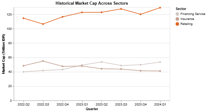
Historical market cap visualization
Now let’s create our next visualization, which will show the historical market cap that we have stored in df_mc_hist
. We only need to slightly modify the data frame to include the market cap in trillion IDR, using the following code:
df_mc_hist["Market Cap (Trillion IDR)"] = df_mc_hist["Market Cap"]/10**12
Your final data frame should look like this:
| Sector | Quarter | Market Cap | Market Cap (Trillion IDR) |
---|
0 | Financing Service | 2022.Q2 | 39870000000000 | 39.870 |
1 | Financing Service | 2022.Q3 | 41848000000000 | 41.848 |
2 | Financing Service | 2022.Q4 | 43047000000000 | 43.047 |
… | … | … | … | … |
We want to use line chart to visualize it, so we use .mark_line()
:
mc_hist_chart = alt.Chart(df_mc_hist).mark_line(
point=True
).encode(
x=alt.X("Quarter:N", axis=alt.Axis(labelAngle=0)),
y=alt.Y("Market Cap (Trillion IDR):Q"),
color=alt.Color(
"Sector:N",
scale=alt.Scale(scheme="lightgreyred"),
sort=alt.SortField(field="Sector", order="ascending")
),
tooltip=[
alt.Tooltip("Sector:N"),
alt.Tooltip("Quarter:N"),
alt.Tooltip("Market Cap (Trillion IDR):Q", format=".2f")
]
).properties(
title="Historical Market Cap Across Sectors",
width=500
)
and that will give a result of the following chart:
Historical market cap change visualization
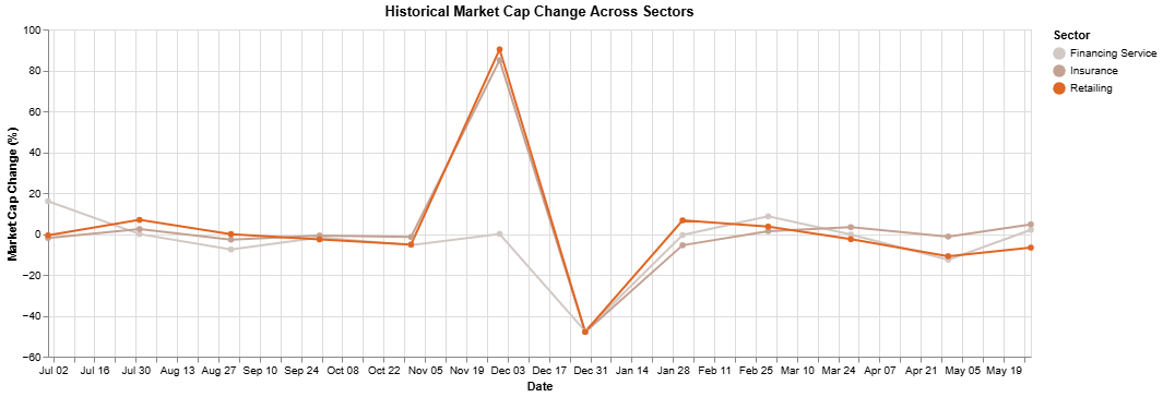
Our last market cap visualization is to show the historical market cap change that we have stored in df_mc_change
. Let’s first change the format of the change from decimal to percentage:
df_mc_change["Market Cap Change (%)"] = df_mc_change["Market Cap Change"] * 100
The final data frame should look like this:
| Sector | Date | Market Cap Change | Market Cap Change (%) |
---|
0 | Financing Service | 2023-06-30 | 1.601451e-01 | 1.601451e+01 |
1 | Financing Service | 2023-07-31 | -7.817735e-04 | -7.817735e-02 |
2 | Financing Service | 2023-08-31 | -7.589136e-02 | -7.589136e+00 |
… | … | … | … | … |
Similar as df_mc_hist
we’ll use line chart to visualize it:
mc_change_chart = alt.Chart(df_mc_change).mark_line(
point=True
).encode(
x=alt.X("Date:T"),
y=alt.Y("Market Cap Change (%):Q"),
color=alt.Color(
"Sector:N",
scale=alt.Scale(scheme="lightgreyred"),
sort=alt.SortField(field="Sector", order="ascending")
),
tooltip=[
alt.Tooltip("Sector:N"),
alt.Tooltip("Date:T"),
alt.Tooltip("Market Cap Change (%):Q", format=".2f")
]
).properties(
title="Historical Market Cap Change Across Sectors",
width=900
)
The result should be similar to this:
Valuation
Now let’s move on to the Valuation. There are four valuation metrics that we’ll try to compare:
- Price/Book Ratio
- Price/Earning Ratio
- Price/Sales Ratio
- Price/Cash Flow Ratio
Valuation data processing
The valuation data can be obtained using the following endpoint:
GET https://api.sectors.app/v1/subsector/report/{sector}/?sections=valuation
Calling it using our function,
url = f"https://api.sectors.app/v1/subsector/report/financing-service/?sections=valuation"
valuation = fetch_data(url)
the result will be:
{
'sector': 'Financials',
'sub_sector': 'Financing Service',
'valuation': {
'historical_valuation': [
{
'pb': 1.12811751473619,
'pe': 15.2263661070692,
'ps': 3.40739205196185,
'pcf': 1.86633862249035,
'year': 2020
},
...,
{
'pb': 0.948839333751776,
'pe': 9.32380217109886,
'ps': 2.96611649951585,
'pcf': -2.66375347445492,
'year': 2024,
'pb_rank': 15,
'pe_rank': 14,
'ps_rank': 26,
'pcf_rank': 4
}
]
}
}
Transform the historical_valuation
into pandas
data frame using the following function,
df = pd.DataFrame(valuation["valuation"]["historical_valuation"])
df["Sector"] = valuation["sub_sector"]
try:
df = df.drop(["pb_rank", "pe_rank", "ps_rank", "pcf_rank"], axis=1)
except:
pass
df.columns = ["Price/Book Ratio", "Price/Earning Ratio", "Price/Sales Ratio", "Price/Cash Flow Ratio", "Year", "Sector"]
we’ll get the following data frame:
| Price/Book Ratio | Price/Earning Ratio | Price/Sales Ratio | Price/Cash Flow Ratio | Year | Sector |
---|
0 | 1.128118 | 15.226366 | 3.407392 | 1.866339 | 2020 | Financing Service |
1 | 1.708792 | 15.256327 | 5.972283 | 2.288791 | 2021 | Financing Service |
2 | 1.322785 | 11.479534 | 5.640499 | -4.803930 | 2022 | Financing Service |
… | … | … | … | … | … | … |
Last step, do a looping to combine the above data of the first three sectors in our list:
df_valuation = pd.DataFrame()
for i in range(3):
url = f"https://api.sectors.app/v1/subsector/report/{sectors[i]}/?sections=valuation"
valuation = fetch_data(url)
df = pd.DataFrame(valuation["valuation"]["historical_valuation"])
df["Sector"] = valuation["sub_sector"]
df_valuation = pd.concat([df_valuation, df], ignore_index=True)
try:
df_valuation = df_valuation.drop(["pb_rank", "pe_rank", "ps_rank", "pcf_rank"], axis=1)
except:
pass
df_valuation.columns = ["Price/Book Ratio", "Price/Earning Ratio", "Price/Sales Ratio", "Price/Cash Flow Ratio", "Year", "Sector"]
Valuation visualization
Now since the data is ready, let’s visualize it. We’ll compare the Price/Book Ratio of the sectors using a line chart:
valuation_chart = alt.Chart(df_valuation).mark_line(
point=True
).encode(
x=alt.X("Year:N", axis=alt.Axis(labelAngle=0)),
y=alt.Y("Price/Book Ratio:Q"),
color=alt.Color(
"Sector:N",
scale=alt.Scale(scheme="lightgreyred"),
sort=alt.SortField(field="Sector", order="ascending")
),
tooltip=[
alt.Tooltip("Sector:N"),
alt.Tooltip("Year:N"),
alt.Tooltip("Price/Book Ratio:Q", format=".2f")
]
).properties(
title="Price/Book Ratio Across Sectors",
width=900
)
That will result in this beautiful chart:
For the other metrics, just change all the 
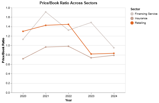
Price/Book Ratio
in the code above with the metric: Price/Earning Ratio
, Price/Sales Ratio
, or Price/Cash Flow Ratio
, and you should get a similar visualization as above but with the chosen metric value.
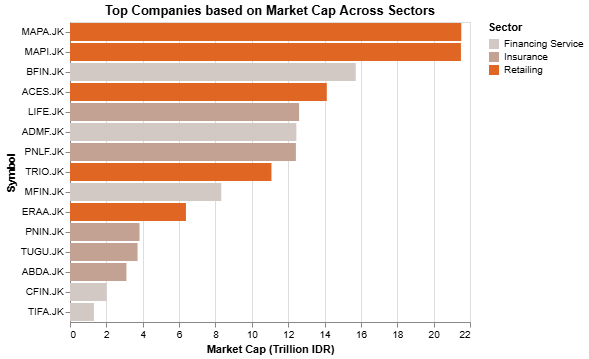
Top Companies
The last aspect we’ll compare between the sectors is the Top Companies. For this comparison, we’ll use four criteria to identify the top companies in each sector:
- Top companies based on Market Cap
- Top companies based on Revenue Growth
- Top companies based on Profit
- Top companies based on Revenue
Top companies data processing
Data for the top companies can be retrieved using the following endpoint:
GET https://api.sectors.app/v1/subsector/report/{sector}/?sections=companies
Call it using our function,
url = f"https://api.sectors.app/v1/subsector/report/{sectors[0]}/?sections=companies"
company = fetch_data(url)
the result will be as the following:
{
'sector': 'Financials',
'sub_sector': 'Financing Service',
'companies': {
'top_companies': {
'top_mcap': [
{
'name': 'BFI Finance Indonesia Tbk',
'symbol': 'BFIN.JK',
'market_cap': 15716172431360
},
...
],
'top_growth': [
{
'name': 'PT Fuji Finance Indonesia Tbk.',
'symbol': 'FUJI.JK',
'revenue_growth': 0.486621562597492
},
...
],
'top_profit': [
{
'name': 'BFI Finance Indonesia Tbk',
'symbol': 'BFIN.JK',
'profit_ttm': 1496543000000
},
...
],
'top_revenue': [
{
'name': 'BFI Finance Indonesia Tbk',
'symbol': 'BFIN.JK',
'revenue_ttm': 6060888000000
},
...
]
},
'top_change_companies': [
{
'pe': 9.24545062492502,
'1yr': 0.0350877192982456,
'1mth': 0.0350877192982456,
'name': 'Buana Finance Tbk',
'symbol': 'BBLD.JK',
'last_close': 590
},
...
]
}
}
Notice that each criteria returns 5 companies.
Now, let’s transform the four keys inside the top_companies
key into four different data frames:
keys = ["top_mcap", "top_growth", "top_profit", "top_revenue"]
dfs = {}
for key in keys:
df = pd.DataFrame(company["companies"]["top_companies"][key])
df["Sector"] = company["sub_sector"]
dfs[key] = df
mc = dfs["top_mcap"]
growth = dfs["top_growth"]
profit = dfs["top_profit"]
revenue = dfs["top_revenue"]
mc.columns = ["Name", "Symbol", "Market Cap", "Sector"]
growth.columns = ["Name", "Symbol", "Revenue Growth", "Sector"]
profit.columns = ["Name", "Symbol", "Profit", "Sector"]
revenue.columns = ["Name", "Symbol", "Revenue", "Sector"]
Let’s use looping to combine the above data for the first three sectors in our list:
df_top_mc = pd.DataFrame()
df_top_growth = pd.DataFrame()
df_top_profit = pd.DataFrame()
df_top_revenue = pd.DataFrame()
for i in range(3):
url = f"https://api.sectors.app/v1/subsector/report/{sectors[i]}/?sections=companies"
company = fetch_data(url)
keys = ["top_mcap", "top_growth", "top_profit", "top_revenue"]
dfs = {}
for key in keys:
df = pd.DataFrame(company["companies"]["top_companies"][key])
df["Sector"] = company["sub_sector"]
dfs[key] = df
df_top_mc = pd.concat([df_top_mc, dfs["top_mcap"]], ignore_index=True)
df_top_growth = pd.concat([df_top_growth, dfs["top_growth"]], ignore_index=True)
df_top_profit = pd.concat([df_top_profit, dfs["top_profit"]], ignore_index=True)
df_top_revenue = pd.concat([df_top_revenue, dfs["top_revenue"]], ignore_index=True)
df_top_mc.columns = ["Name", "Symbol", "Market Cap", "Sector"]
df_top_growth.columns = ["Name", "Symbol", "Revenue Growth", "Sector"]
df_top_profit.columns = ["Name", "Symbol", "Profit", "Sector"]
df_top_revenue.columns = ["Name", "Symbol", "Revenue", "Sector"]
Top companies based on market cap visualization
We just need to slightly modify the df_top_mc
before it’s ready to be visualized:
df_top_mc["Market Cap (Trillion IDR)"] = df_top_mc["Market Cap"]/10**12
Now, we’ll use bar chart (.mark_bar()
) to visualize the df_top_mc
:
mc_chart = alt.Chart(df_top_mc).mark_bar().encode(
x=alt.X("Market Cap (Trillion IDR):Q"),
y=alt.Y("Symbol:N", sort="-x"),
color=alt.Color(
"Sector:N",
scale=alt.Scale(scheme="lightgreyred"),
sort=alt.SortField(field="Sector", order="ascending")
),
tooltip=[
alt.Tooltip("Sector:N"),
alt.Tooltip("Symbol:N"),
alt.Tooltip("Market Cap (Trillion IDR):Q", format=".2f")
]
).properties(
title="Top Companies based on Market Cap Across Sectors",
width=900,
height=500,
)
Here is the result:
Top companies based on revenue growth visualization
Slightly change the revenue growth from decimal to percentage:
df_top_growth["Revenue Growth (%)"] = df_top_growth["Revenue Growth"] * 100
The code to visualize it is as follows:
growth_chart = alt.Chart(df_top_growth).mark_bar().encode(
x=alt.X("Revenue Growth (%):Q"),
y=alt.Y("Symbol:N", sort="-x"),
color=alt.Color(
"Sector:N",
scale=alt.Scale(scheme="lightgreyred"),
sort=alt.SortField(field="Sector", order="ascending")
),
tooltip=[
alt.Tooltip("Sector:N"),
alt.Tooltip("Symbol:N"),
alt.Tooltip("Revenue Growth (%):Q", format=",.2f")
]
).properties(
title="Top Companies based on Revenue Growth Across Sectors",
width=900,
height=500,
)
and the result is:
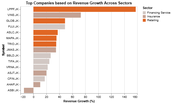
Top companies based on profit visualization
For profit, we want to change the unit of measurement from IDR to Billion IDR:
df_top_profit["Profit (Billion IDR)"] = df_top_profit["Profit"]/10**9
Let’s visualize it using the following code:
profit_chart = alt.Chart(df_top_profit).mark_bar().encode(
x=alt.X("Profit (Billion IDR):Q"),
y=alt.Y("Symbol:N", sort="-x"),
color=alt.Color(
"Sector:N",
scale=alt.Scale(scheme="lightgreyred"),
sort=alt.SortField(field="Sector", order="ascending")
),
tooltip=[
alt.Tooltip("Sector:N"),
alt.Tooltip("Symbol:N"),
alt.Tooltip("Profit (Billion IDR):Q", format=",.2f")
]
).properties(
title="Top Companies based on Profit Across Sectors",
width=900,
height=500,
)
The result will be:
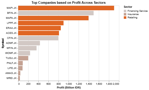
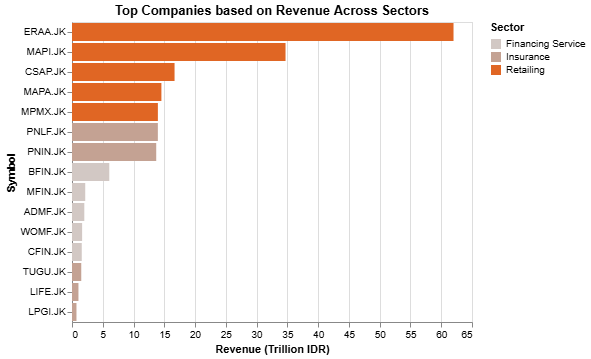
Top companies based on revenue visualization
Last one, we’ll first add new column for the revenue in trillion IDR using the following code:
df_top_revenue["Revenue (Trillion IDR)"] = df_top_revenue["Revenue"]/10**12
Similar with the other top companies visualization, we’ll also use bar chart for this one:
revenue_chart = alt.Chart(df_top_revenue).mark_bar().encode(
x=alt.X("Revenue (Trillion IDR):Q"),
y=alt.Y("Symbol:N", sort="-x"),
color=alt.Color(
"Sector:N",
scale=alt.Scale(scheme="lightgreyred"),
sort=alt.SortField(field="Sector", order="ascending")
),
tooltip=[
alt.Tooltip("Sector:N"),
alt.Tooltip("Symbol:N"),
alt.Tooltip("Revenue (Trillion IDR):Q", format=",.2f")
]
).properties(
title="Top Companies based on Revenue Across Sectors",
width=900,
height=500,
)
And the result is as follows:
Next Step
In the next part, we’ll elevate everything we’ve accomplished by seamlessly integrating it into Streamlit. This will transform our work into a fully functional, interactive app. Stay tuned, because we’re only halfway there, and the best is yet to come!